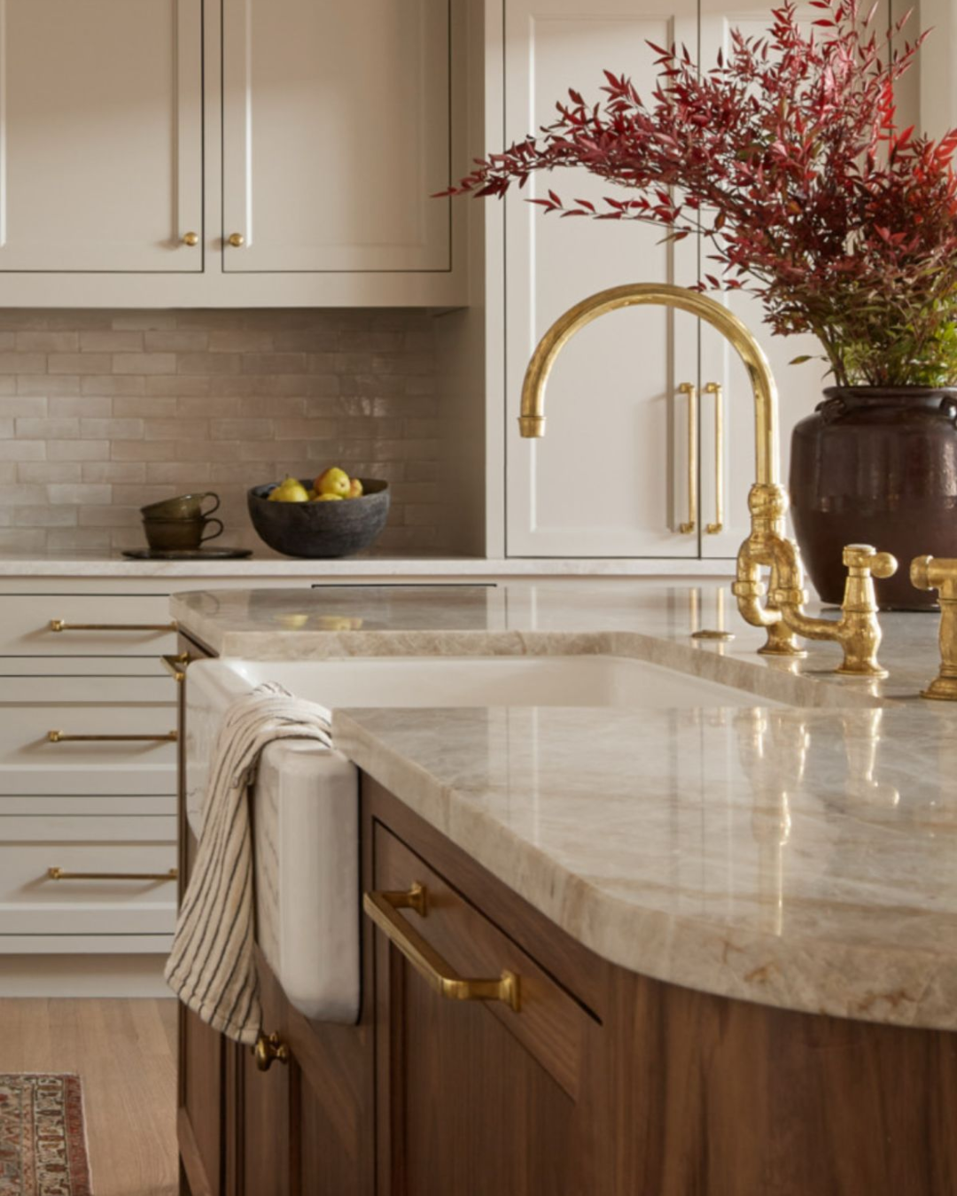
Cream is that effortless color that always looks chic without even trying. It is soft, warm, and somehow never really out of style. Whether you use it on your walls or in your wardrobe, cream has this subtle way of making everything feel a little more elevated.
Read MoreTaj Mahal quartzite has quickly become a designer favorite, and once you see it in a finished kitchen, it is easy to understand why. It offers the soft movement and elegant veining people love about marble, but with the durability and resilience needed for real, everyday life. It is that rare material that feels luxurious and approachable at the same time.
Read MoreOlive green is having a serious moment right now, and it’s easy to see why. This earthy, grounded tone brings warmth, depth, and a sense of calm to both interiors and wardrobes. It feels rich without being overpowering and neutral enough to pair beautifully with wood, stone, leather, and brass. Think of it as the sophisticated cousin to beige and taupe.
Read MoreLooking for the perfect paint color for your bedroom? I’ve got you covered.
Bedroom colors for 2026 are all about creating a calm, layered retreat—the kind of space you walk into at the end of the day and instantly exhale. And there isn’t one right way to get there. There are three directions I’m loving right now that all feel moody, soothing, and beautifully designed.
Read MoreIt sounds crazy, but choosing a white paint color might be my number one most-asked question. White paint isn’t just white—there are undertones that make a color feel cooler or warmer, creamier or crisper, and they really only show up once the paint is in your space, next to your trim, floors, and furniture.
Read More