Sage Green: The Color That Feels Like a Deep Breath
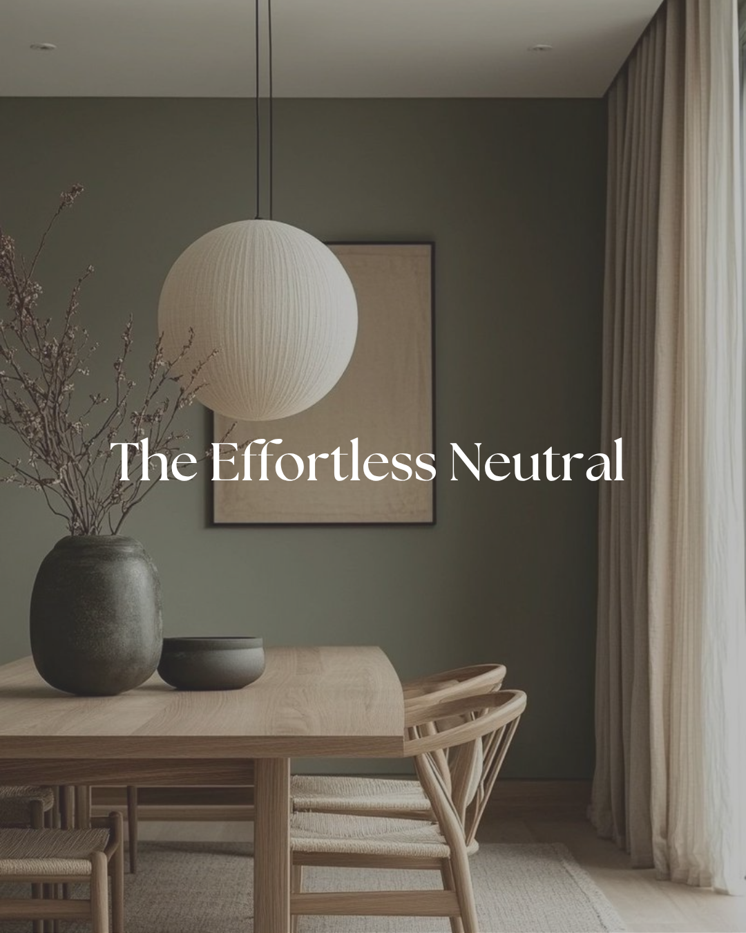
Sage green is having a moment — and honestly, it couldn't be better timed. As we lean into a more grounded, slower, and intentionally beautiful way of living, this color hits that perfect sweet spot between fresh and timeless. It's soft without being boring, elevated without trying too hard, and it plays incredibly well with everything from warm woods to crisp whites to those richer, moodier tones we're all still loving.
In your home, sage instantly brings a sense of calm and quiet luxury. In your wardrobe? Same magic. It's that effortless neutral you didn't know you needed — subtle, chic, and quietly saying "I have great taste" without ever needing to shout.
Why Sage Green Works So Well
Sage sits in that beautiful in-between place where green becomes almost neutral. It has just enough color to feel intentional, but it never overwhelms a space or an outfit. It reads differently depending on the light — warmer in morning sun, cooler and more silvery in the evening — which gives it a really organic, lived-in quality that feels special throughout the day.
It also layers beautifully. Sage is one of those rare colors that works with warm tones and cool tones, which makes it incredibly flexible. Wood, stone, linen, cream, rust, navy — sage plays well with all of it.
My Favorite Sage Green Paint Colors
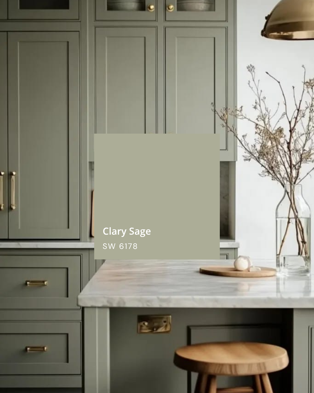
Clary Sage — Sherwin-Williams
Clary Sage is a beautiful, slightly muted sage with warm, herby undertones. It feels grounded and sophisticated — not too blue, not too yellow — which makes it one of the most livable sage greens out there. It's a great choice for living rooms, bedrooms, or anywhere you want a color that feels calm and collected without disappearing into the wall.
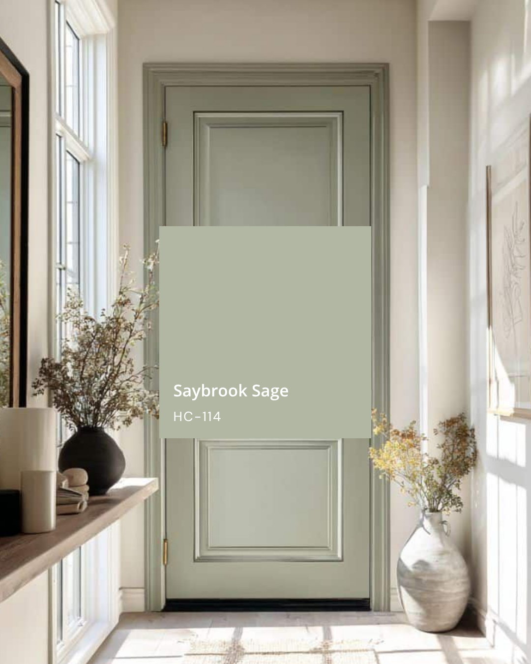
Saybrook Sage — Benjamin Moore
Saybrook Sage is a cooler, more silvery sage that has a really refined, classic quality to it. It's been around for a while, and there's a reason it stays popular — it feels timeless without feeling dated. This one is especially beautiful in spaces with a lot of natural light, where it can really glow.
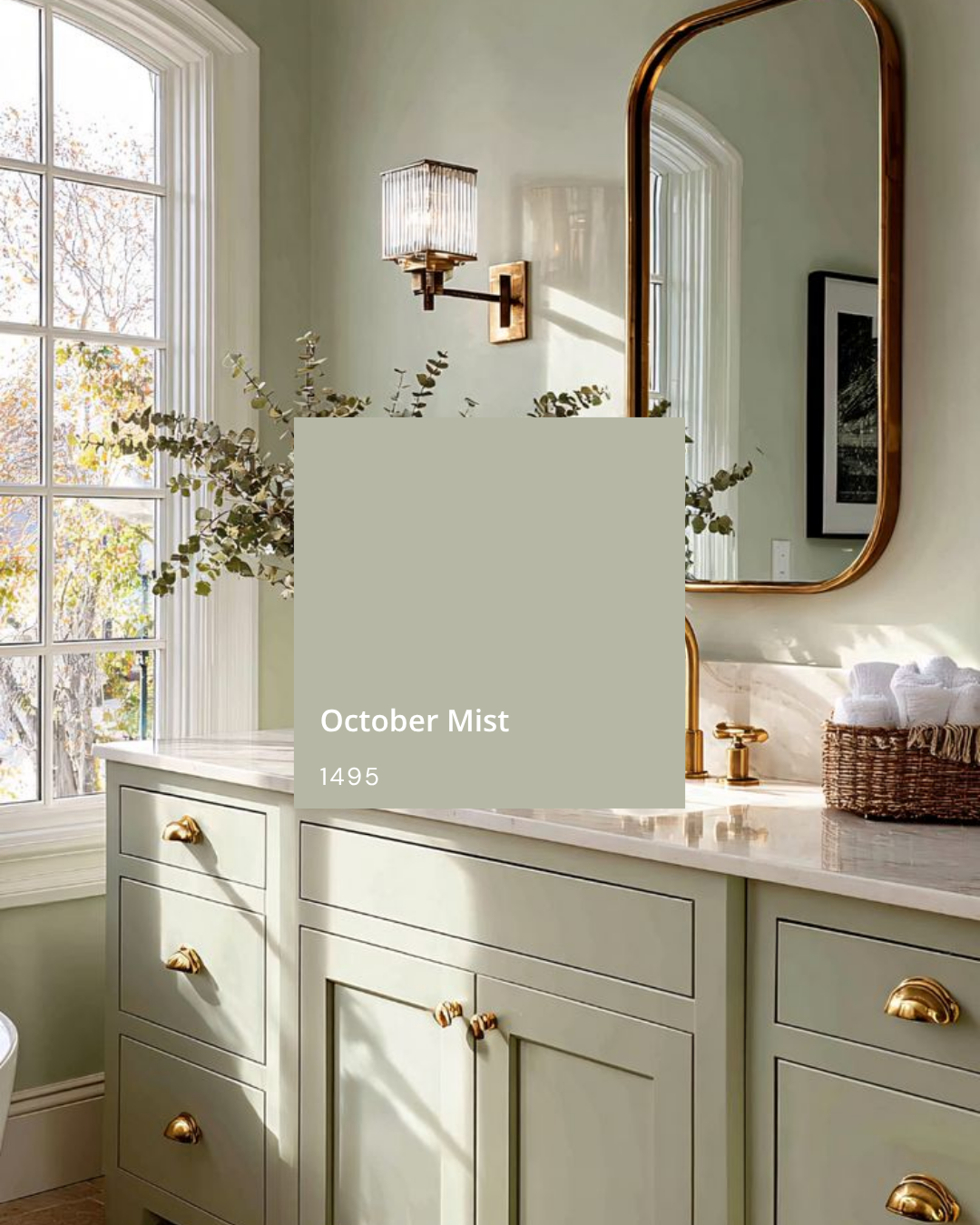
October Mist — Sherwin-Williams
October Mist was actually Benjamin Moore's Color of the Year back in 2022, and it has absolutely earned its staying power. It's a soft, silvery sage with cool, slightly grey undertones that give it a really refined, understated quality. It never feels loud or overly green — it's more like the idea of sage, which is exactly what makes it so beautiful and so easy to live with. It works incredibly well on walls, cabinetry, and trim, and it's especially stunning in spaces with natural light where those soft grey-green tones can really shift and breathe throughout the day.
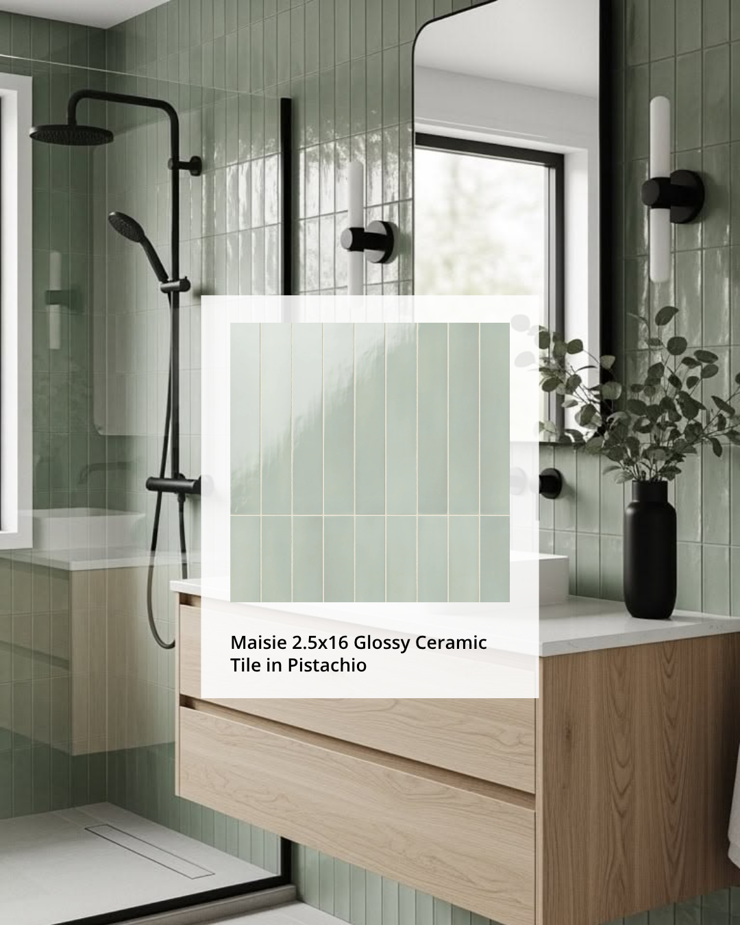
One tile I'm absolutely loving with sage right now is the Maisie 2.5x16 Glossy Ceramic Tile in Pistachio. The vertical format gives it that sleek, elongated look that feels both modern and timeless, and the glossy finish adds just enough light and movement without ever feeling flashy. It's the kind of tile that photographs beautifully but also just lives beautifully — which is really what you want.
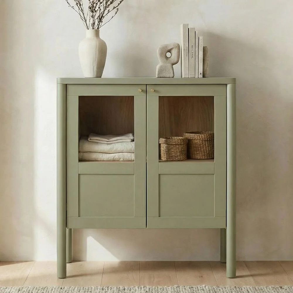
How To Use Sage Green In a Room
Sage is one of the most versatile paint colors you can choose because it supports so many different design directions. It can feel earthy and warm, soft and romantic, or clean and modern depending on what you pair it with.
Some of my favorite ways to use it at home:
On walls in a bedroom for a soft, restful backdrop
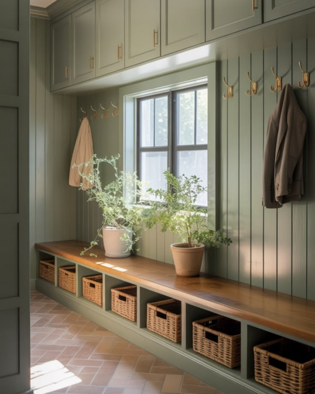
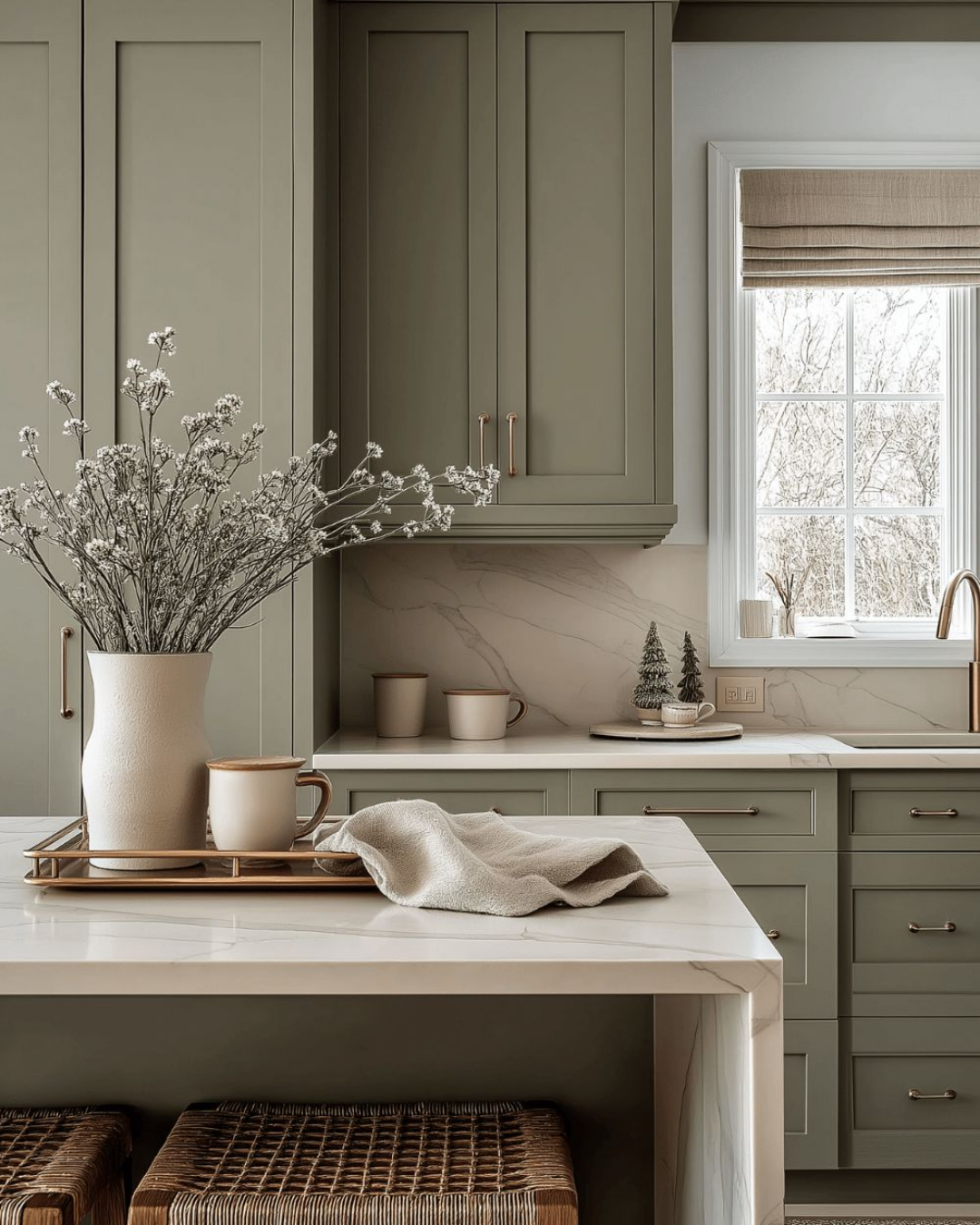
On kitchen or bathroom cabinetry with unlacquered brass or warm matte hardware
In a living room with warm linen, wood tones, and layered textures
On an exterior with white trim and natural stone details
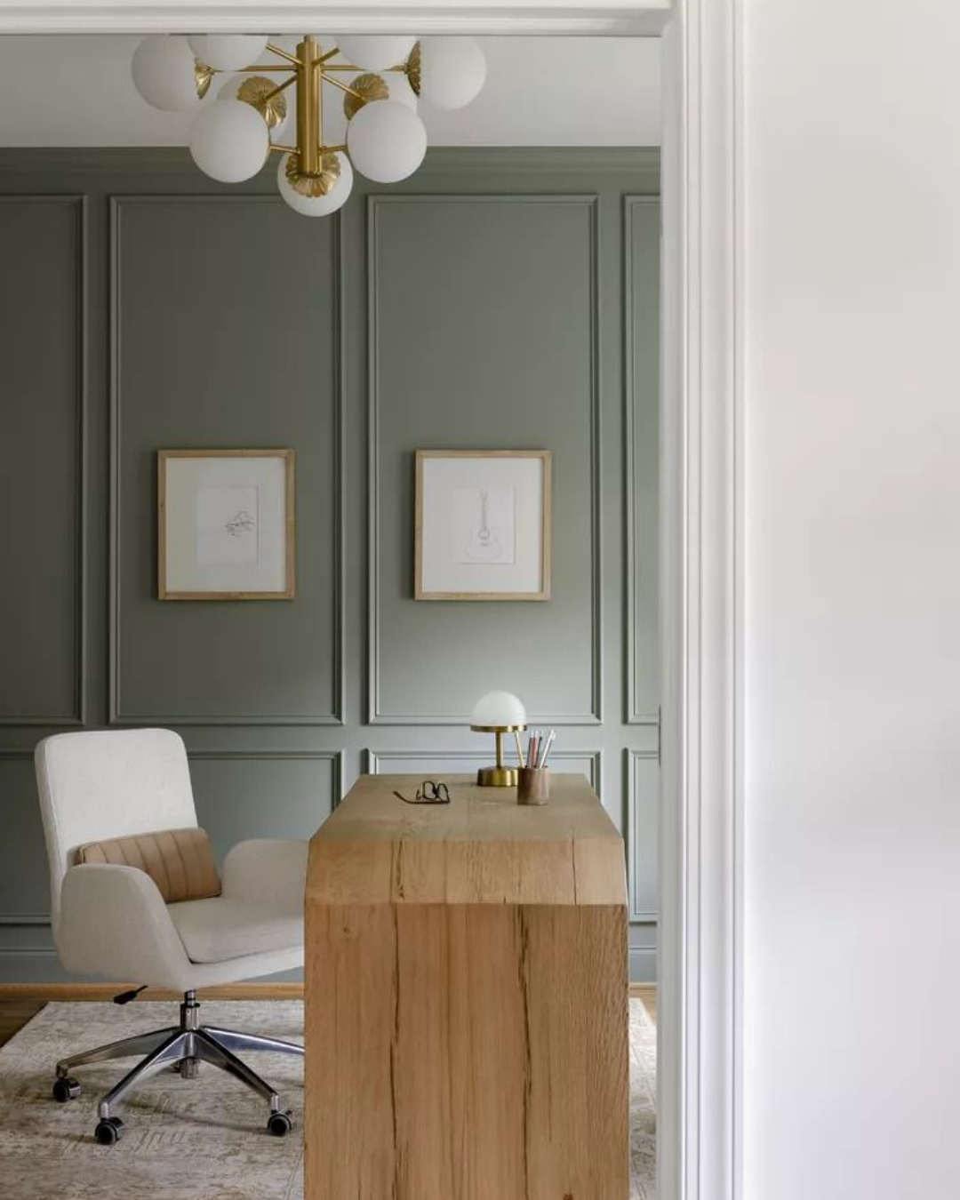
As an accent wall in a dining room or office for a grounded, cozy feel
Shop the look here
Sage is especially beautiful when you let texture do some of the work. A sage wall feels richer when it's paired with woven textiles, natural wood, handmade pottery, and soft layered lighting. The color supports everything around it without competing.
Sage Green In Your Wardrobe
Sage is one of those rare colors that flatters almost everyone because it's soft enough to be gentle on complexion without blending in. It has a subtle warmth to it that makes skin look really beautiful, and it works across every season — think linen in summer, a cozy knit in fall, a tailored coat in winter.

Shop the look here
Sage works especially well in:
Soft button-down tops and relaxed linen sets
Tailored trousers and wide-leg pants
Knit sweaters and cardigans layered over white or cream
A structured midi coat or blazer
Dresses that feel effortless but elevated

Shop the look here
What I love most about sage in a wardrobe is how easily it pairs. It looks incredible with cream, ivory, camel, tan, denim, rust, and even soft blush. You can build an entire capsule wardrobe around it without things ever feeling one-note.

Shop the look here
How To Style Sage
In interiors and fashion alike, sage looks especially beautiful with:
Warm neutrals like cream, linen, and camel
Warm wood tones and rattan
Rust, terracotta, and warm earthy tones for contrast
Soft blush or dusty rose for a more feminine, layered feel
Crisp white for a clean, fresh pairing
Unlacquered brass or warm gold accents
The key with sage is to lean into the softness rather than fight it. It pairs best with things that feel organic, warm, and a little imperfect — which is exactly what makes it feel so livable and so right for where design is heading.
Shop My Sage Favorites
I've rounded up my favorite sage-inspired finds for both your home and your wardrobe — because once you start seeing this color, you'll want it everywhere.
Sage green is one of those colors that doesn't just look beautiful — it feels beautiful. It brings a sense of quiet, intention, and ease to everything it touches, which is exactly the kind of energy we could all use a little more of right now.