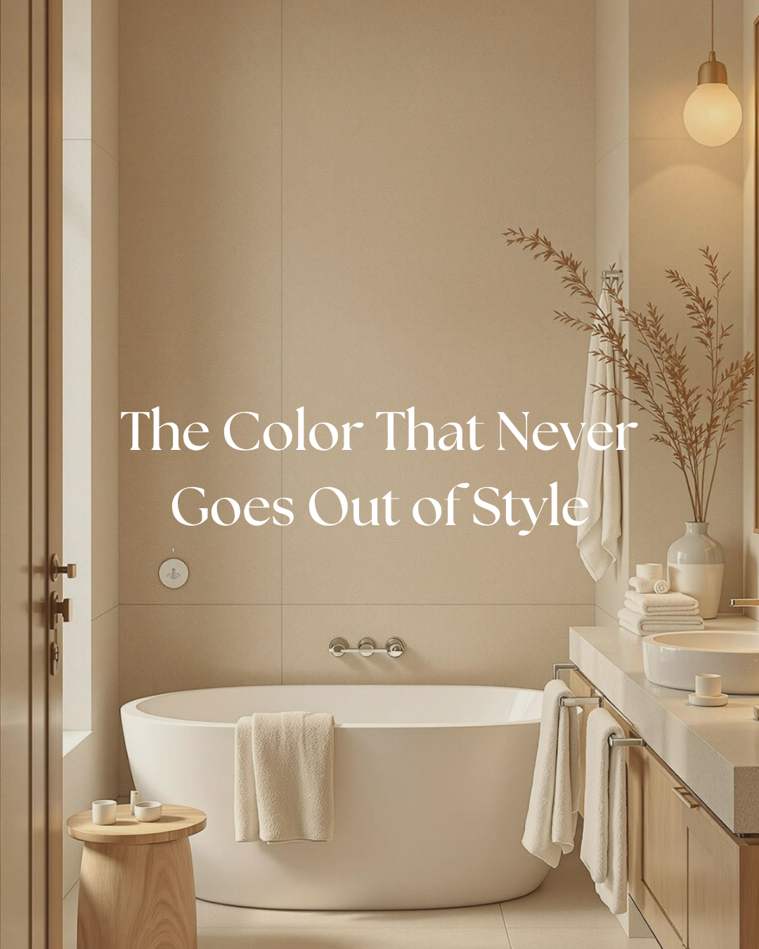
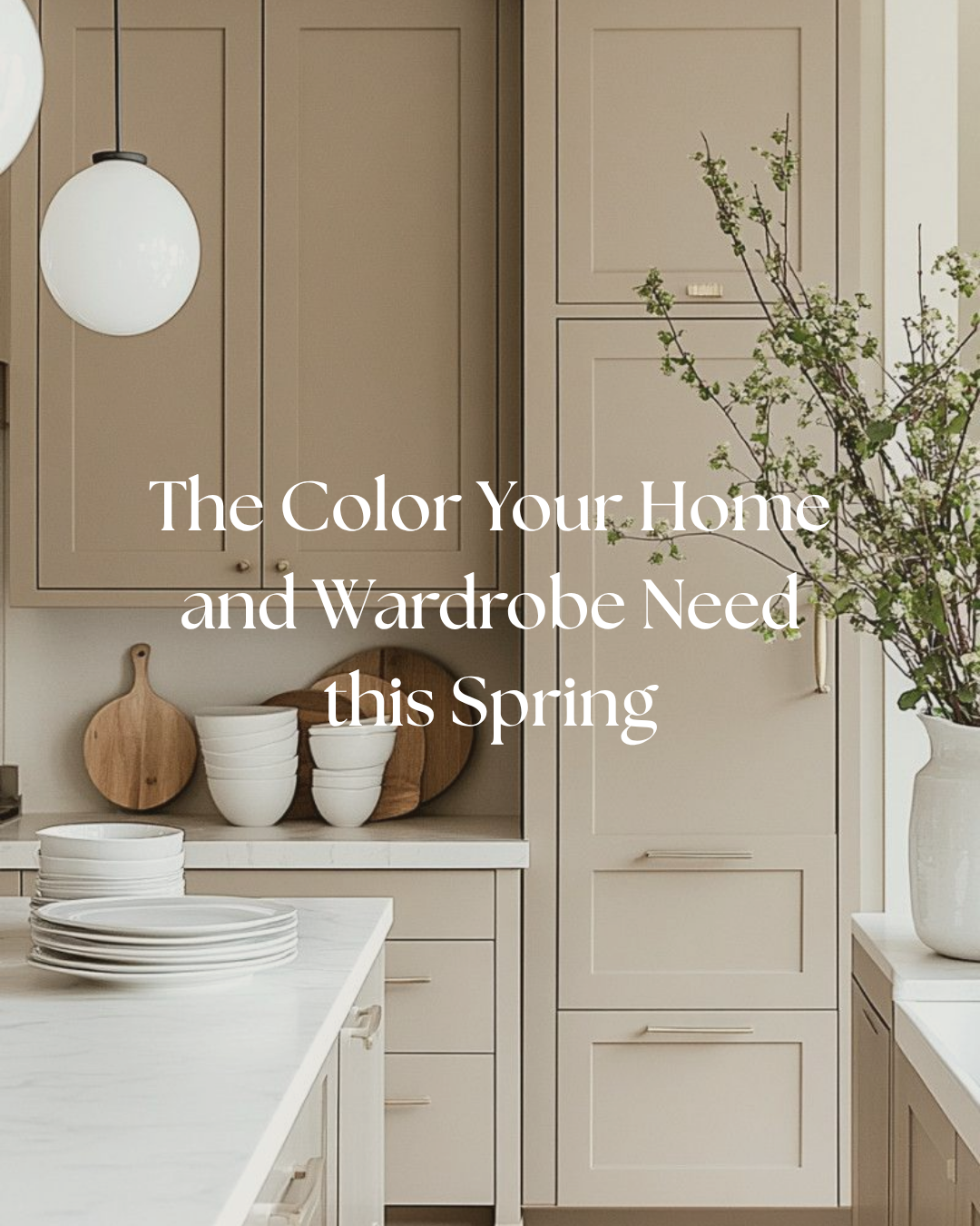
Taupe is one of those colors that never really goes out of style. It lives beautifully between beige and gray, which makes it feel soft, grounded, and incredibly versatile. It is calm without being cold, warm without feeling yellow, and interesting without being overpowering.
Read MoreYour kid’s bedroom walls deserve more than boring beige. The right paint color can completely change the feeling of the room, turning it into a space that feels playful, personal, and quietly curated. Whether you want something sweet and calming, moody and dramatic, or soft and warm, the paint color you choose really does help build the whole world of the room.
Read MoreDusty blue is having a moment, and honestly, it deserves it. It’s softer than navy, more elevated than pastels, and somehow manages to feel both fresh for spring and timeless year-round. In your home, it reads calm, collected, and quietly luxurious—whether it shows up in cabinetry, upholstery, or a full-room moment that feels like a deep exhale.
Read MoreTile is one of those design moments where you can quietly play it safe or completely elevate a space without changing anything else. It has the power to bring texture, pattern, and personality into a room in a way that feels subtle but impactful. Lately, I’ve been loving tiles that feel both timeless and a little unexpected.
Read MoreCream is that effortless color that always looks chic without even trying. It is soft, warm, and somehow never really out of style. Whether you use it on your walls or in your wardrobe, cream has this subtle way of making everything feel a little more elevated.
Read More