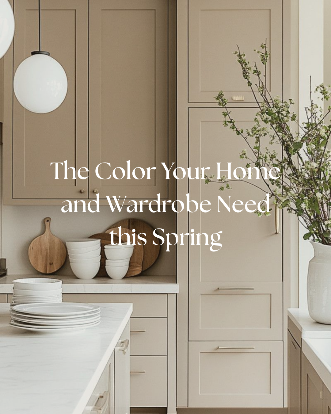
Taupe: The Quiet Neutral That Always Works
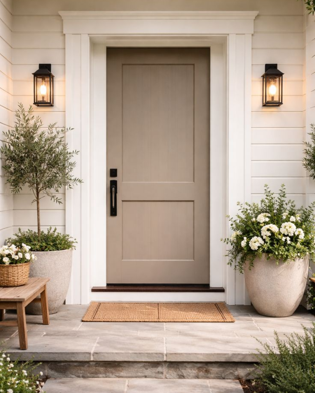
Taupe is one of those colors that never really goes out of style. It lives beautifully between beige and gray, which makes it feel soft, grounded, and incredibly versatile. It is calm without being cold, warm without feeling yellow, and interesting without being overpowering.
That balance is exactly why taupe works so well in both interiors and wardrobe styling. It can feel cozy and layered in a bedroom, refined in a living space, and effortlessly polished in fashion. It is the kind of neutral that quietly supports everything around it.
Why Taupe Feels So Timeless
Taupe is such a useful neutral because it adapts easily to the rest of the room. Depending on the light and what it is paired with, it can lean warmer, cooler, softer, or more elevated. That flexibility makes it a great choice when you want something subtle but still dimensional.
It also pairs beautifully with natural materials. Wood, stone, linen, brass, leather, and matte tile all look especially good with taupe because the color supports texture instead of competing with it. That is why taupe always feels so collected and livable.
My Favorite Taupe Paint Colors
Here are the taupe paint colors I love most right now:
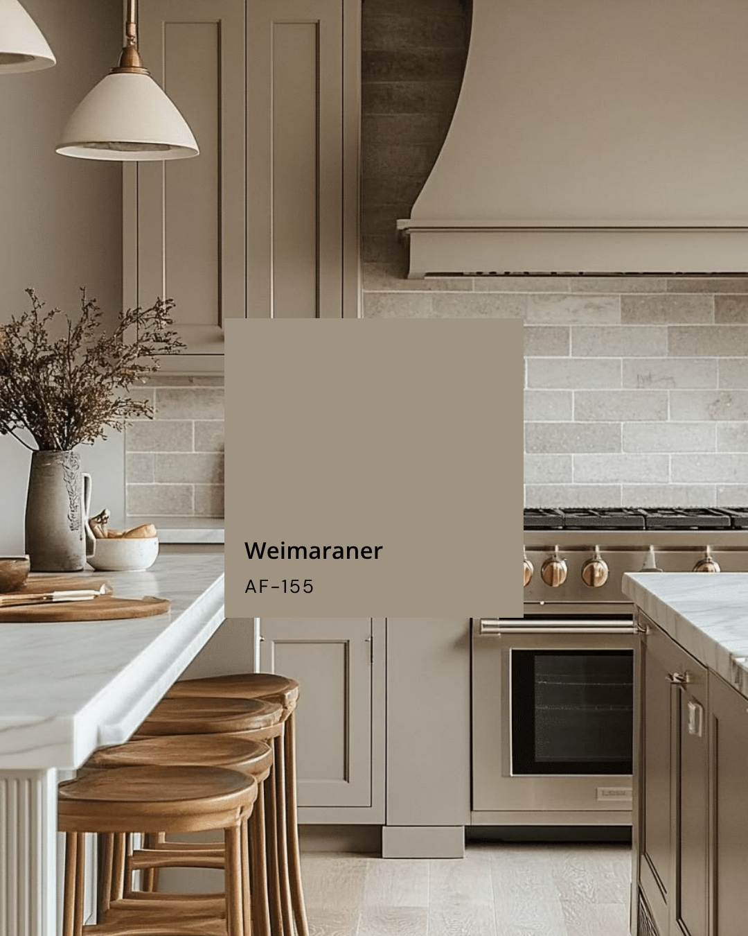
Weimaraner is a soft, balanced taupe with a warm, grounded feel. It has enough depth to feel substantial, but it still reads as a beautiful neutral that works in bedrooms, living rooms, and cozy transitional spaces.
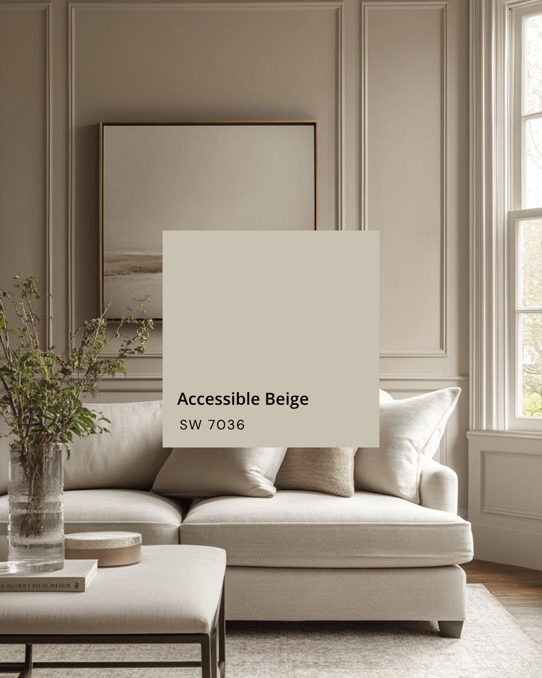
Accessible Beige is one of those classic, easy paint colors that almost always works. It is warm and inviting, with just enough softness to keep it from feeling too beige or too gray. It is especially good if you want a neutral backdrop that feels relaxed and versatile.
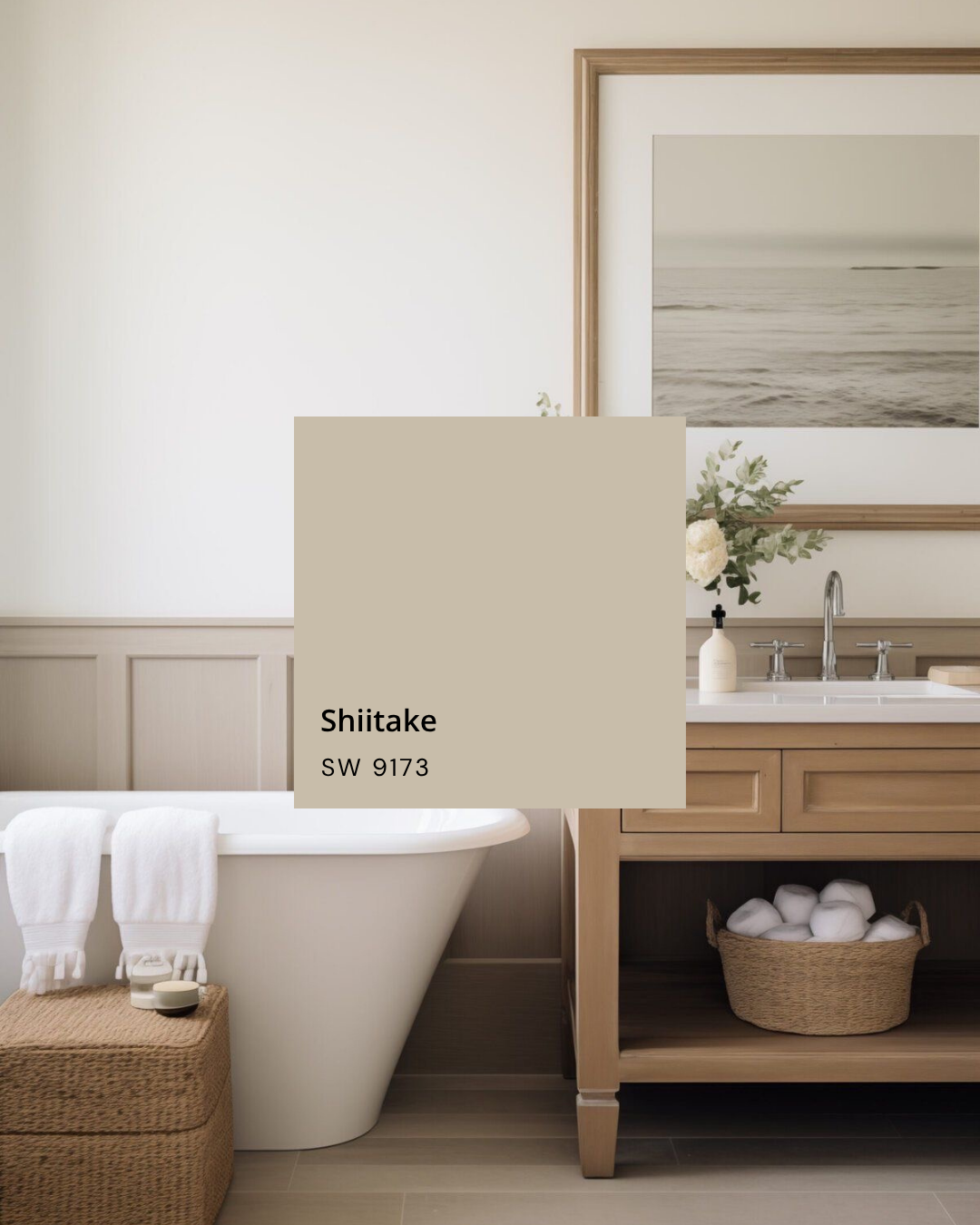
Shiitake is a richer taupe-beige that brings a little more depth. It feels earthy and sophisticated, which makes it a strong option for walls, cabinetry, or trim when you want the room to feel layered and a little more tailored.
A few other taupe favorites I also love are Pale Oak, Tony Taupe, Taupe Tone, and Edgecombe Gray. Pale Oak feels soft and light with a gentle taupe undertone. Tony Taupe has a deeper, more grounded presence. Taupe Tone is a great in-between shade if you want something that feels warm but not too beige. Edgecombe Gray leans a bit more muted and can be a beautiful option when you want taupe with a slightly cooler, more refined edge.
How To Use Taupe In A Room
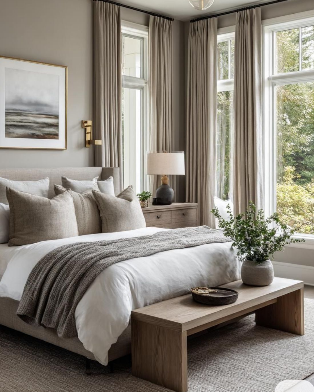
Taupe works especially well when you want a room to feel calm and collected. It is a great option for walls, trim, cabinetry, built-ins, and upholstered furniture. Because it is so flexible, it can support both traditional and more modern spaces depending on what you pair it with.
Some of my favorite ways to use taupe at home:
In a bedroom for a soft, restful backdrop.
On cabinetry with brass or bronze hardware.
On walls with crisp white trim for a layered, classic look.
In a living room with warm wood and linen textures.
In a bathroom with stone, tile, and matte finishes.
Taupe is especially beautiful when you let texture do some of the work. A taupe wall feels richer when it is paired with woven materials, natural wood, handmade tile, or a mix of matte and soft reflective finishes.
The Tile I Love With Taupe
One tile I especially love with taupe is Leona 12x12 checkerboard matte porcelain tile in Calacatta and Marfil. It feels elevated but still approachable, and the checkerboard pattern adds visual interest without making the room feel busy.
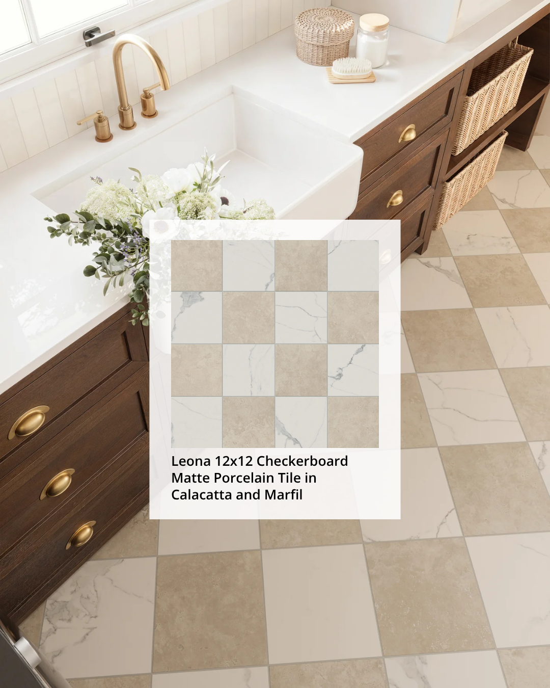
The soft contrast of Calacatta and Marfil works beautifully with taupe because it keeps the palette warm and understated. It is a great example of how tile can bring in pattern while still feeling timeless and neutral.
Taupe In Your Wardrobe
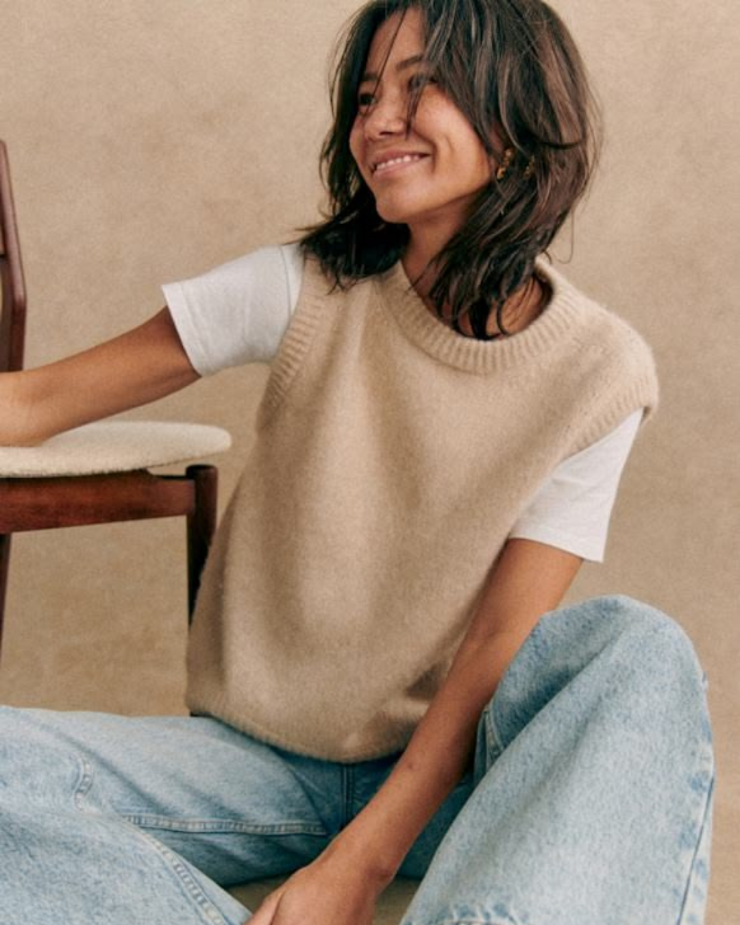
Taupe is one of the most flattering fashion neutrals because it feels softer than gray and warmer than black. It gives outfits an easy, refined quality without trying too hard. That makes it perfect for getting dressed in a way that feels intentional but relaxed.
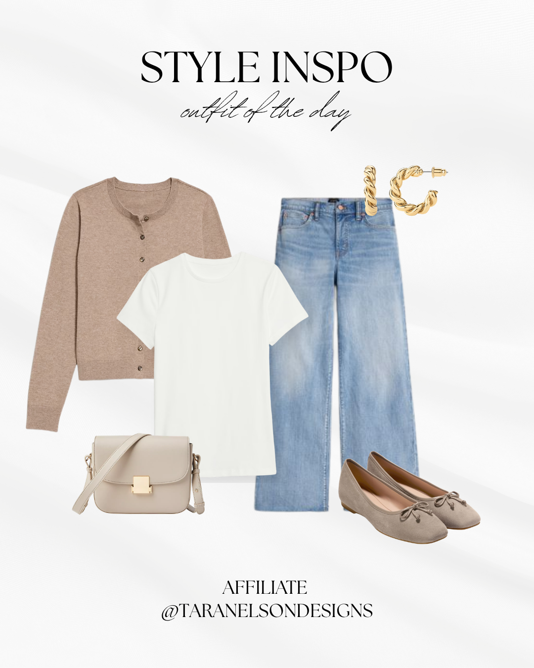
Shop the look here
Taupe works especially well in:
Tailored trousers or wide-leg pants.
A blazer or lightweight coat.
Cashmere sweaters and soft knits.
Leather bags, loafers, and belts.
Layered looks with cream, ivory, denim, or black.
If you want your outfit to feel polished but not severe, taupe is a great color to reach for. It gives that quiet luxury feel and plays nicely with both warm and cool tones.
How To Style Taupe
Taupe looks especially beautiful with:
Cream and ivory for a soft monochromatic feel.
Black and charcoal for a little more contrast.
Warm wood tones and natural textures.
Brass or matte black accents.
Linen, leather, wool, and woven materials.
In interiors, this combination keeps the room feeling layered and warm. In fashion, it creates outfits that feel effortless and elevated at the same time.
Shop My Taupe Favorites
If you love taupe as much as I do, I’ve rounded up my favorite taupe-inspired finds for home and wardrobe.
Taupe quietly elevates everything around it — walls, furniture, tile, and outfits. It is one of those neutrals that never feels boring because it always brings just enough softness, warmth, and depth to make a space or look feel finished.