Create Your Own Sunshine With This Color
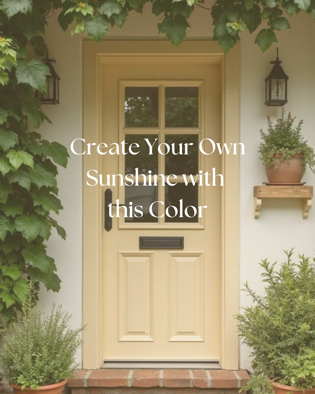
Butter yellow is having a moment—and yes, it’s every bit as dreamy as it sounds.
There’s something irresistibly soft about this shade: not quite gold, not quite cream, but that perfect buttery glow that catches the light just right. In your wardrobe, it’s effortless—flattering on nearly every skin tone and instantly brightening your look with a whisper of sunshine. But when it comes to interiors? This color deserves a bit more thought and intention.
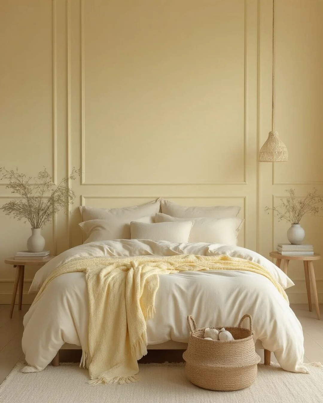
Butter Yellow in Your Home
Yellow can be surprisingly tricky to get right on your walls. A tone too bright leans neon; too soft, and it can read as beige. The sweet spot is that creamy, slightly muted butter tone—warm, but never sugary.
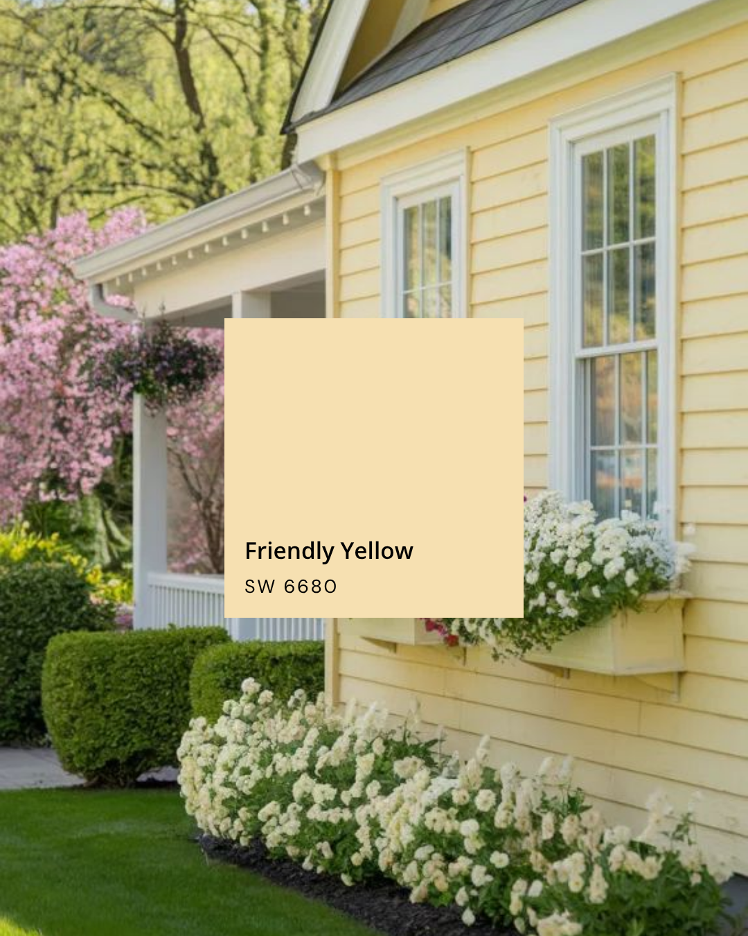
Friendly Yellow — Sherwin Williams
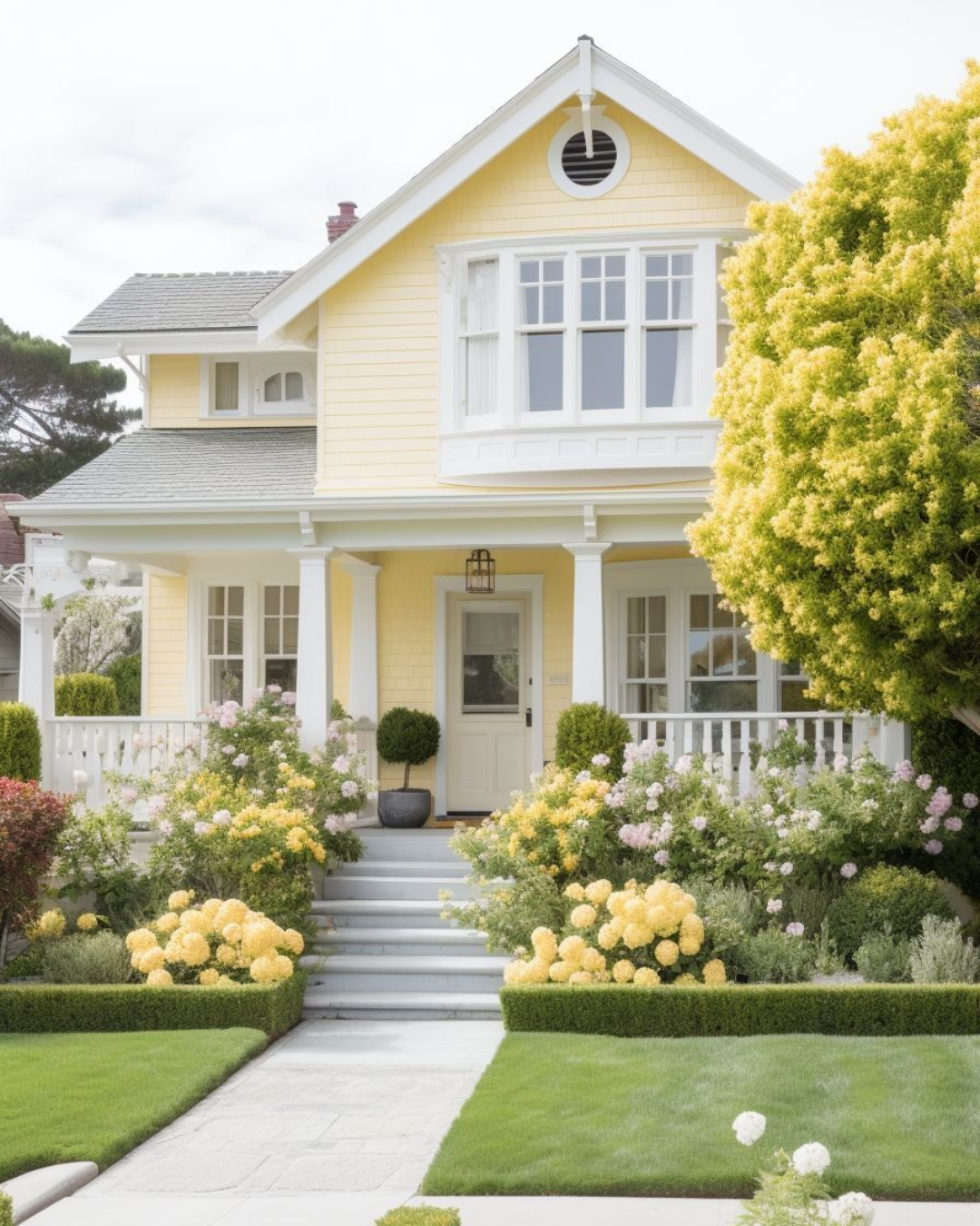
Bright, cheerful, and full of personality, Friendly Yellow is a happy choice for exteriors, cabinetry, or even a front door. It reads fresh and welcoming in sunlight and instantly lifts curb appeal. Try it with creamy white trim or soft gray shutters for that sunny, balanced glow that feels optimistic but refined.
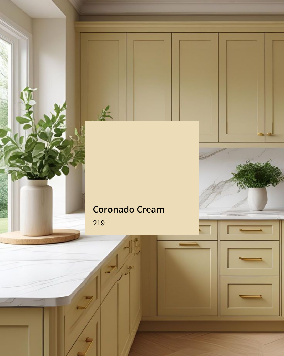
Coronado Cream — Benjamin Moore
Warm, buttery, and gently golden, Coronado Cream brings a sunlit feel to any space. It’s especially beautiful on cabinetry in a yellow kitchen—classic yet cheerful, it makes the whole room feel inviting and full of light. Pair it with creamy trim, brushed brass hardware, and natural textures for a look that’s both timeless and uplifting.
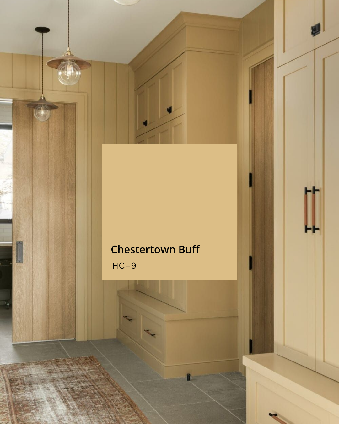
Chestertown Buff — Benjamin Moore
Rich without being overpowering, Chestertown Buff brings instant warmth to hardworking spaces like mudrooms or laundry rooms. It pairs beautifully with natural wood tones, terracotta flooring, and aged brass for a look that feels timeless and lived-in. A perfect backdrop for woven baskets, rain boots, and everyday charm.
Shop my favorite yellow finds here
A few other yellow paint colors I love are:
Dayroom Yellow (Farrow & Ball) – delicate and sunlight-loving, ideal for airy spaces
Philadelphia Cream (Benjamin Moore) – subtle sophistication with a hint of warmth
Hawthorne Yellow (Benjamin Moore) – rich but not overwhelming, perfect for historic homes
Butter Up (Sherwin-Williams) – soft and buttery, beautiful for trim or porch ceilings
Think of butter yellow as a “supporting actor” rather than the lead—it shines when surrounded by materials and tones that counterbalance its warmth.
Pair it with:
Warm woods to ground the color and add contrast
Soft whites or creamy neutrals for a layered, tone-on-tone moment
Touches of charcoal or muted blues for sophistication and depth
Shop my favorite yellow home decor here
For outdoor spaces, I love using pops of yellow on front doors, garden furniture, or planters. It pairs beautifully with green landscapes and instantly makes an entryway feel friendly and lived-in—especially in spring and summer when everything outside vibrates with life.
Shop My Yellow Home Favorites
If you love butter yellow as much as I do, I’ve rounded up my favorite yellow-inspired finds for your home.
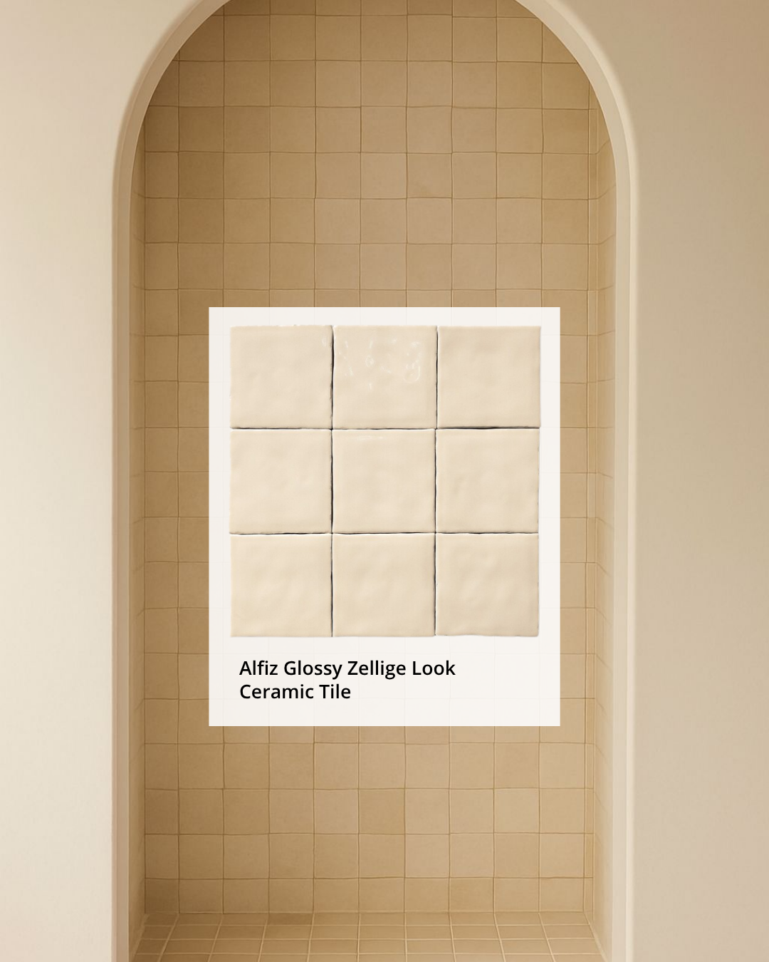
The Pale Yellow Tile I Love
One tile I especially love is the Alfiz Glossy Zellige Look Ceramic Tile. It adds a handcrafted touch that balances butter yellow’s softness with a bit of texture and shine. Its subtle variation and glossy finish bring movement and depth—perfect for a backsplash, laundry wall, or small accent that catches the light just right.
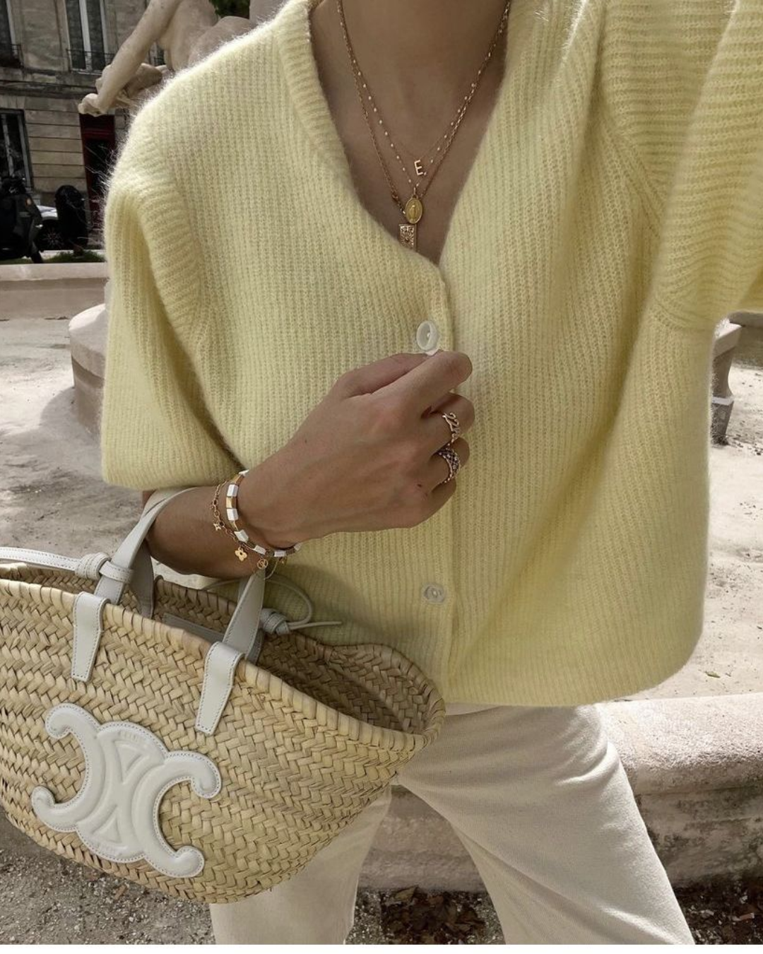
Butter Yellow in Fashion
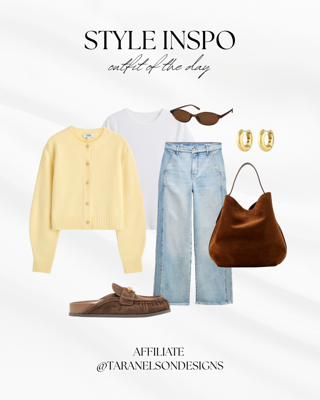
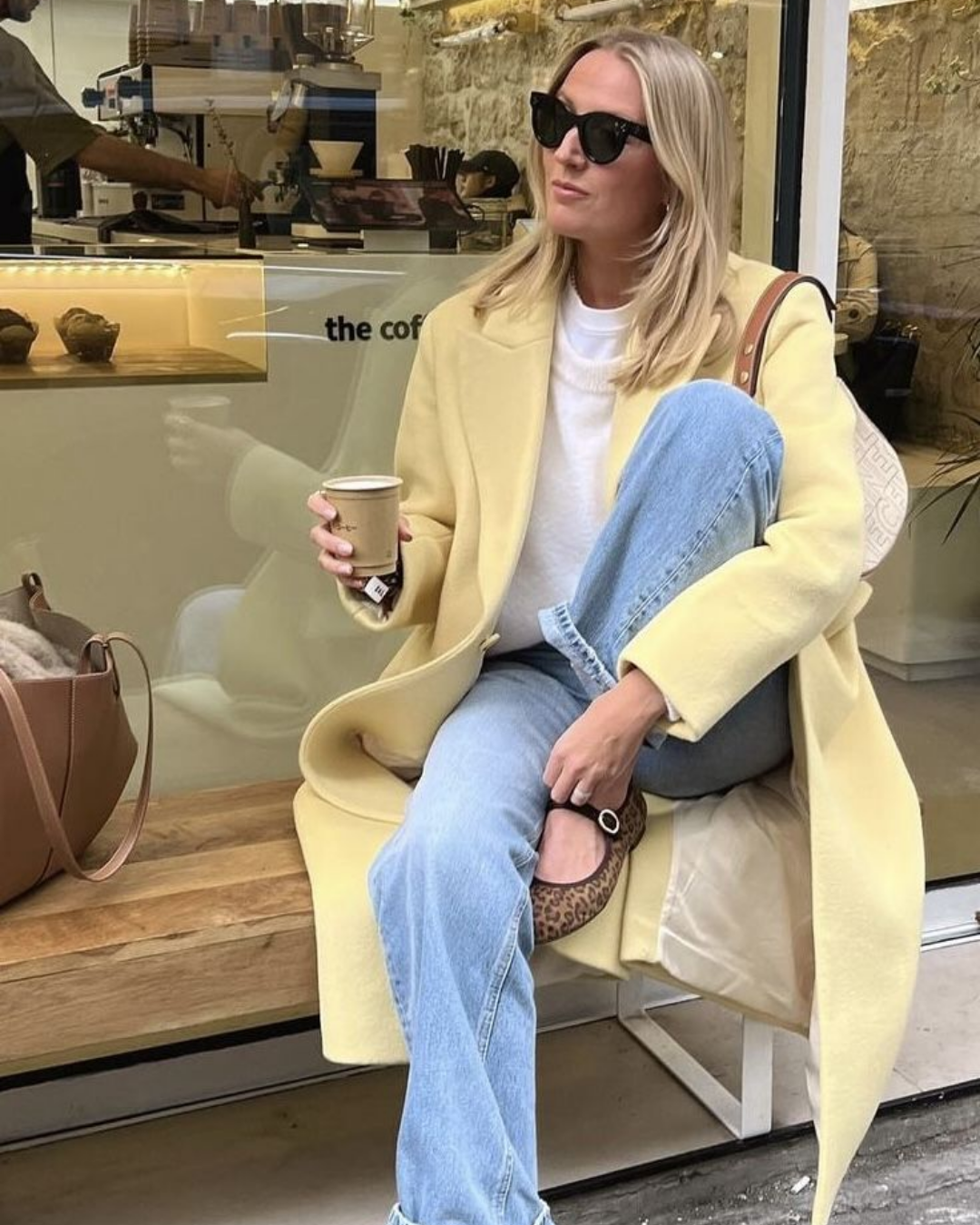
Where interiors call for precision, style invites play. Butter yellow feels effortless in fabrics—silky dresses, linen trousers, cozy knits. It glows in natural light and pairs easily with white, khaki, denim, or soft neutrals.
Shop the look here
Try mixing textures: a butter-yellow blouse with crisp white shorts for daytime or a slinky pastel dress with gold jewelry for evening. The key is to let the color breathe—keeping your palette simple so the yellow can take center stage without feeling loud.
Shop the look here
A Color for Every Season
Butter yellow isn’t here only for spring—it transitions beautifully year-round. In summer, it’s radiant and warm; in fall, it softens beside browns and rusts; in winter, it’s a cheerful lift against cozy neutrals.
Shop the look here
It’s a hue that reminds us of sunlight, simplicity, and a little optimism—and in both fashion and design, that’s something we can never have too much of.
Wear it freely. Design with intention. That’s the magic of butter yellow. 💛
Shop My Yellow Fashion Favorites
If you love butter yellow as much as I do, I’ve rounded up my favorite yellow-inspired finds for your wardrobe.

Butter yellow is one of those shades that feels easy at first glance, but the magic is really in the details. Whether you’re wearing it in a soft knit, bringing it into your kitchen cabinets, or using it to brighten up an exterior space, it’s all about keeping the tone creamy, balanced, and intentional. When done well, it brings just enough sunshine to feel fresh, happy, and timeless.