Calming Bedroom Paint Colors for 2026
Looking for the perfect paint color for your bedroom? I’ve got you covered.
Bedroom colors for 2026 are all about creating a calm, layered retreat—the kind of space you walk into at the end of the day and instantly exhale. And there isn’t one right way to get there. There are three directions I’m loving right now that all feel moody, soothing, and beautifully designed.
Think earthy tones for a grounded, cozy feel, beachy pastels for a soft, serene vibe, and timeless creamy whites that never go out of style. Each one can give you that “I never want to leave this room” feeling.
Earthy: Moody Greens, Clays, and Deep Navies
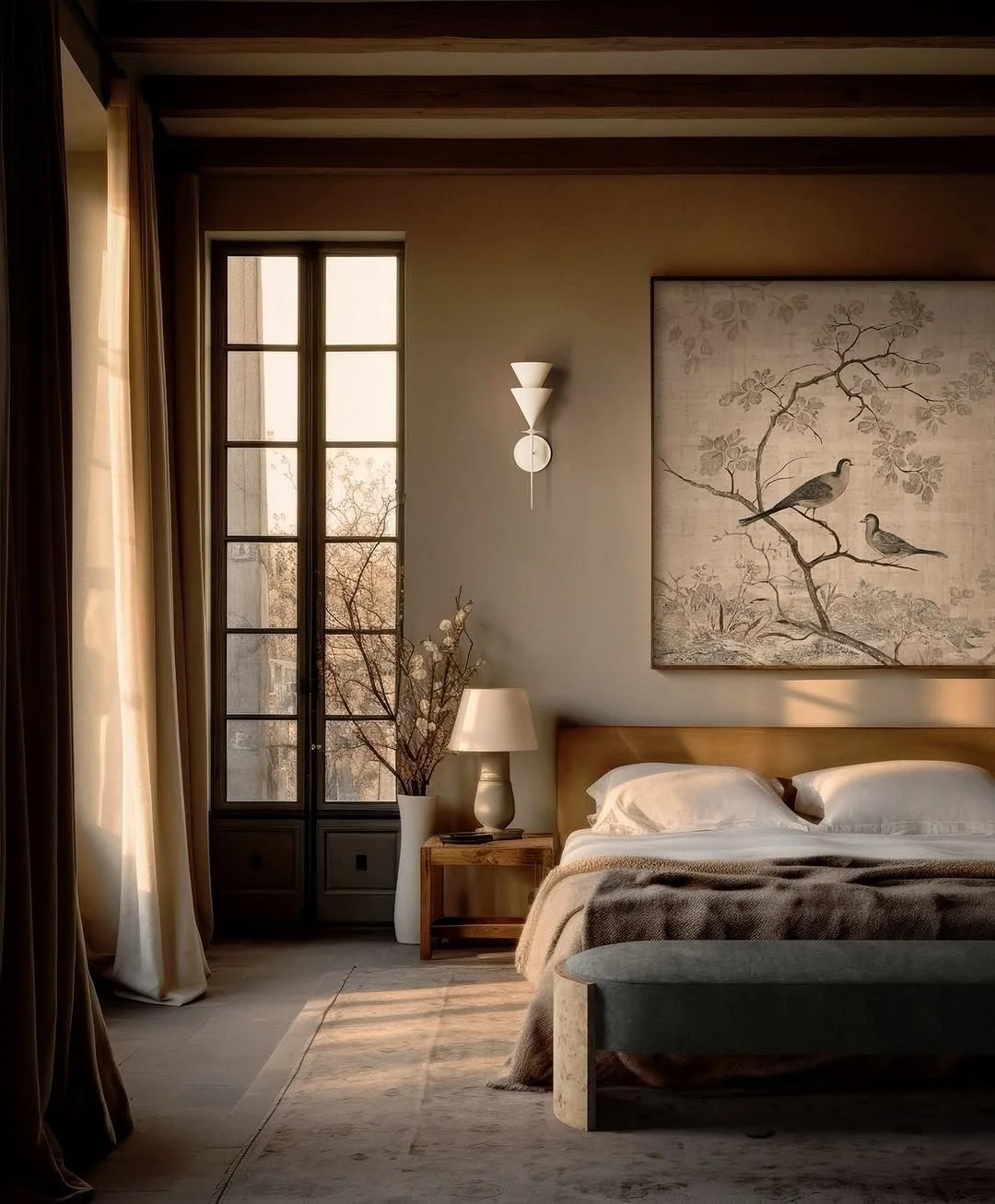
If you love a bedroom that feels cocooning and grounded, this is your palette. Earthy colors add mood and depth, but still read calm and livable when you choose the right tones.
Think warm clay, soft olive, and mushroom brown—translated into real paint colors, that looks like:
Evergreen Fog – a muted green that feels organic and calming.
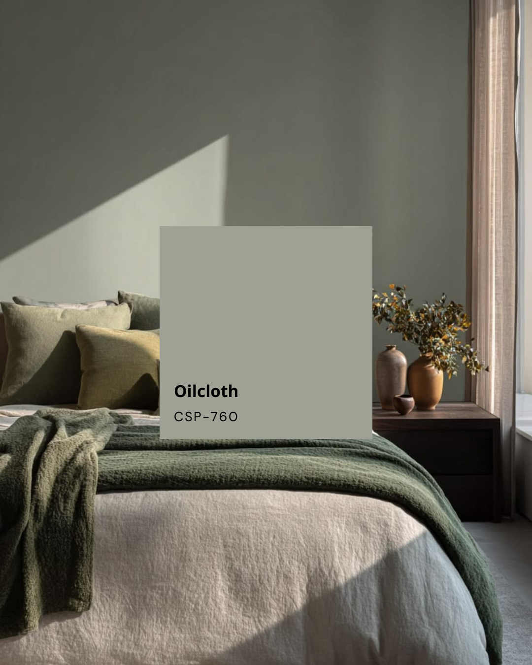
Oilcloth – a soft, complex neutral that pairs beautifully with wood and woven textures.
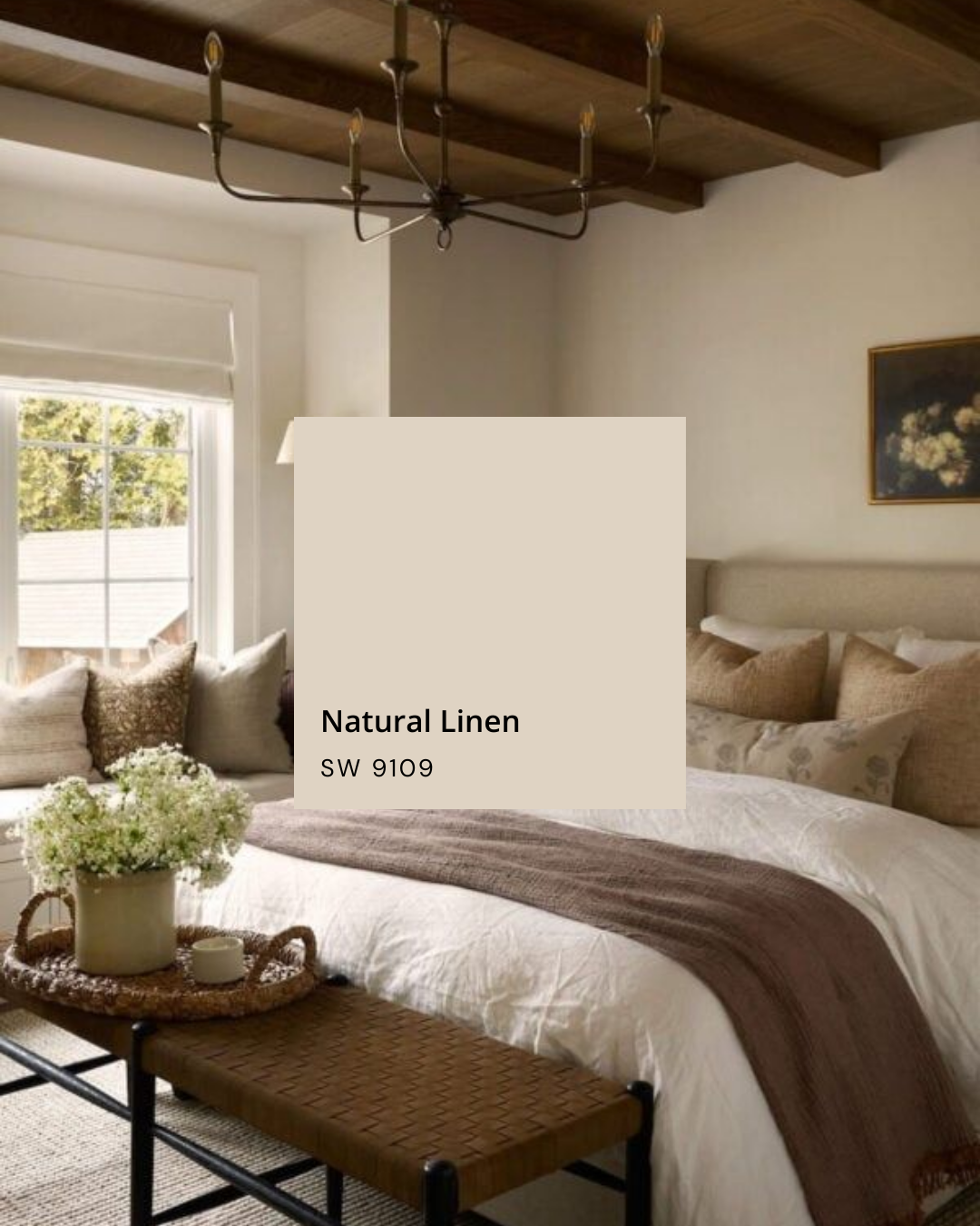
Natural Linen and Taupe of the Morning – warm, stone-y neutrals that layer beautifully without feeling flat.
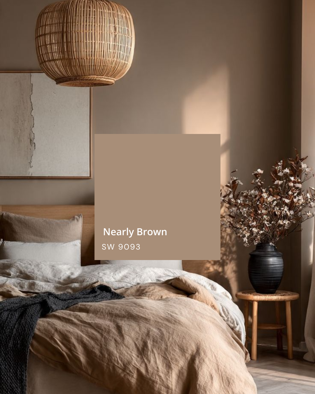
Nearly Brown and Barista – richer, cocoa tones that bring in warmth and a touch of drama.
Hale Navy – a deep navy-black that’s perfect for color drenching all four walls (and even the ceiling) for a moody, enveloping feel.
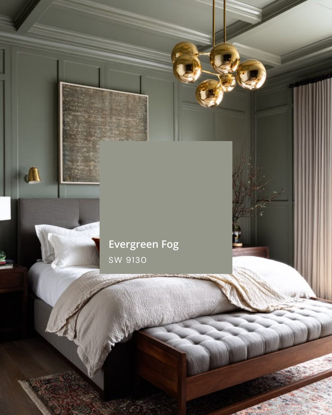
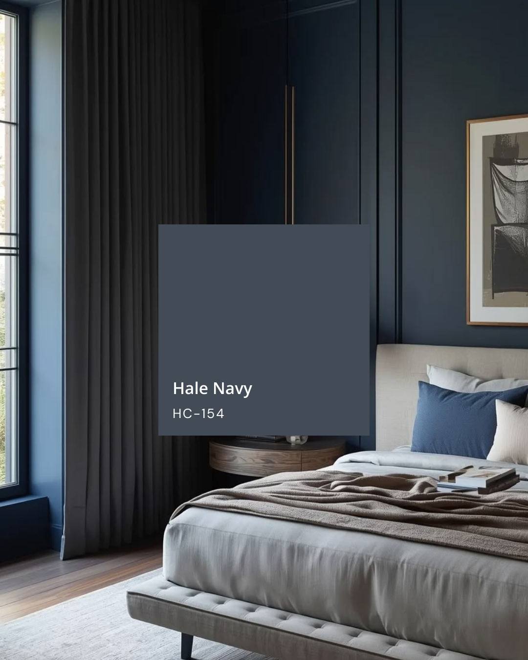
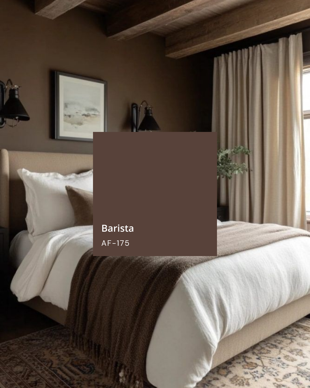
These colors shine when you lean into texture: linen bedding, wool throws, woven shades, and warm wood or black accents. Instead of one loud “feature” wall, think of wrapping the whole room in one beautiful shade so it feels finished and intentional.
Pastels: Beachy, Light, and Serene
Pastels in the bedroom aren’t about bubblegum or baby colors—they’re about that beachy, quiet, coastal calm. If you want your space to feel lighter while still being soothing, this direction is for you.
Try gentle pastels like:
Powder blue that feels like a hazy sky.
Soft blush that adds warmth without reading “pink room.”
Coastal green or sea-glass blue-green that instantly feels like a seaside escape.
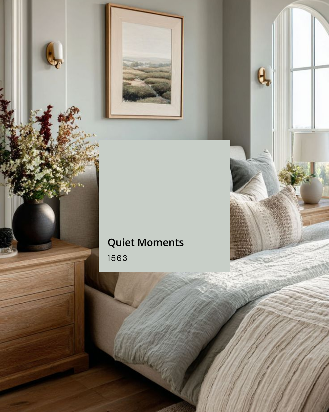
Quiet Moments – a watery, blue-green that’s soft, airy, and incredibly relaxing on the walls.
Keep the rest of the room simple and textural so the color can breathe: neutral bedding, natural woods or rattan, and a few repeating color moments in pillows or artwork. The result is a room that feels fresh, light, and serene—never busy.
Timeless: Creamy Whites (That Aren’t Boring)
Creamy whites are the most timeless choice and a perfect backdrop if you like to switch up your bedding and decor often. The key is choosing whites that feel warm and soft—not stark or cold. I have an entire post dedicated to choosing the right white paint and your can find it here.
Enlist classic creamy whites that feel warm, timeless, and effortlessly elegant, like:
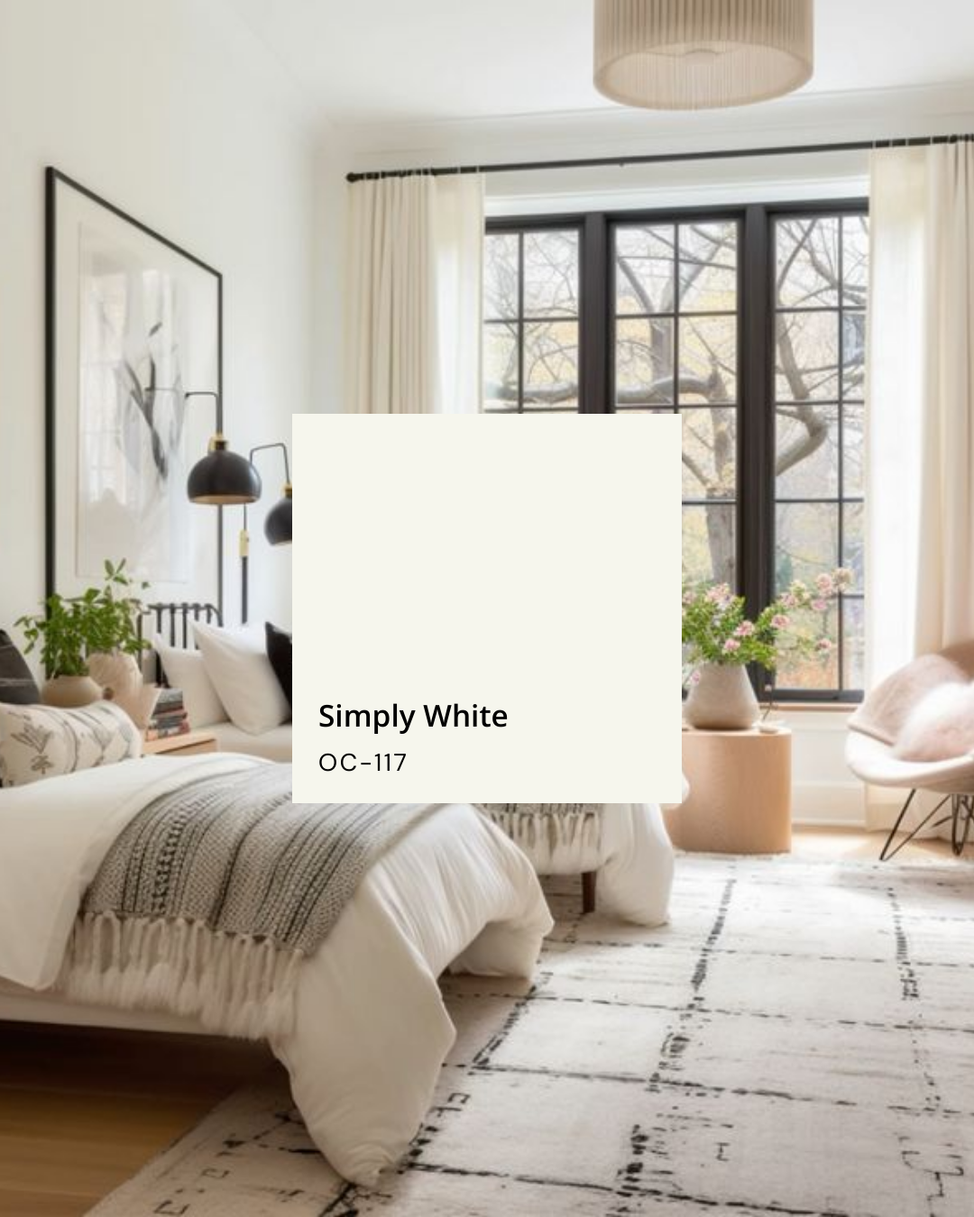
Simply White
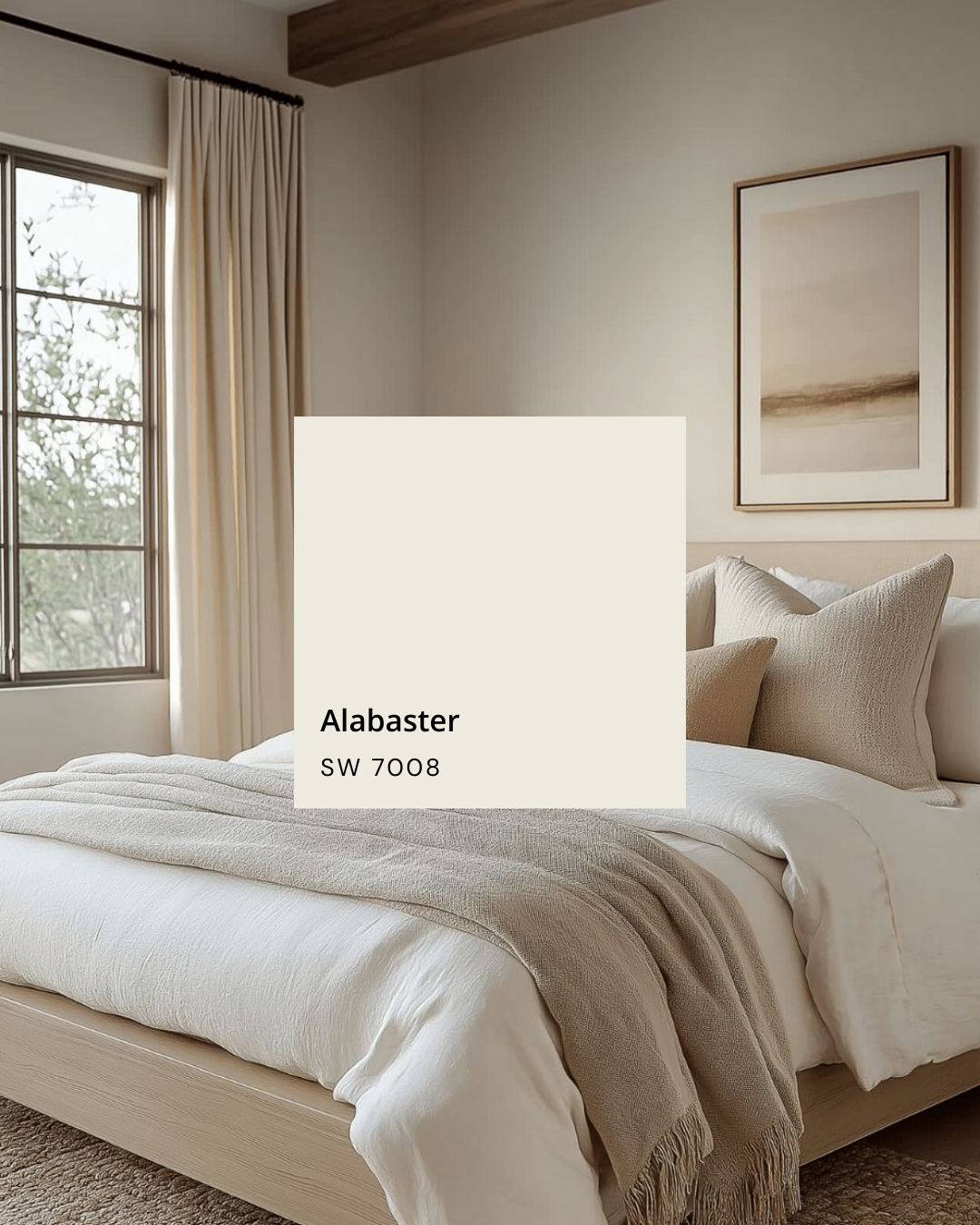
Alabaster
You can layer in a shade like Natural Linen here too if you want something just a touch deeper and more grounded. These colors make a beautiful canvas for everything else: layered neutrals, natural wood, black accents, or even a pop of color in your pillows and art.
To keep a white bedroom from feeling flat, focus on layers: quilted bedding, knit throws, textured pillows, woven shades, and soft lighting. The room stays bright and calming, but still feels warm and inviting.
How to Choose Your Palette
Each of these palettes creates a bedroom that feels sophisticated, restful, and beautifully designed—the kind of space you never want to leave.
When you’re deciding which direction to go:
Choose Earthy if you love mood, depth, and a cozy, cocooning feel.
Choose Pastels if you want a light, beachy, quietly colorful room.
Choose Timeless Creams if you want maximum flexibility and a calm, elevated backdrop.
Always test a few samples on your actual walls, and look at them morning, afternoon, and evening. Paint shifts throughout the day, and your bedroom deserves a color that looks good in every mood and every light.
A Note on Inspiration Photos
The images in my original Instagram post — and likely the photos you’ve saved on Pinterest — are a great starting point, but remember: every room has different light, finishes, and exposures. Use them as inspiration, not a guarantee that the exact same color will look identical in your home.
Disclaimer: The photos that inspired this post are sourced from Pinterest and various blogs. They are not my work. If you see your work featured and I’ve missed tagging you, please reach out so I can credit you properly.
For more paint tips, home styling ideas, and real-life design inspiration, don’t forget to like, save, and follow @taranelsondesigns for more home and lifestyle content.