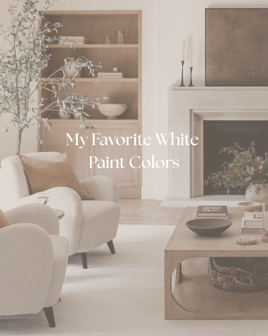
My Favorite White Paint Colors (And How to Choose the Right One)
It sounds crazy, but choosing a white paint color might be my number one most-asked question. White paint isn’t just white—there are undertones that make a color feel cooler or warmer, creamier or crisper, and they really only show up once the paint is in your space, next to your trim, floors, and furniture.
That’s why the same white can look perfect in one home and completely off in another. In this post, I’m walking through what undertones actually are, when to use warm vs. cooler whites, and sharing my go-to white paints you truly can’t go wrong with.
Why White Paint Is So Tricky
On a paint chip, most whites look almost identical. On a whole wall, you suddenly see:
A creamy, almost buttery warmth
A slightly gray or taupe cast
A cooler, almost blue or icy edge
Or a “dingy” look you didn’t expect
Those are undertones. Every white leans warm, cool, or somewhere in the middle, and your light (north vs. south facing), your flooring, and your other finishes will exaggerate those undertones.
This is why I always recommend testing white paints on your actual walls instead of choosing straight from your phone or a tiny chip.
Warm Whites: Cozy, Soft, and Timeless
Warm whites feel creamy and inviting—never stark—and they’re beautiful in homes with lots of natural texture and warmth.
Use warm whites when:
You have wood floors, woven pieces, brass or bronze metals, and warmer finishes.
You want your home to feel cozy, layered, and lived in.
Your rooms get cooler light and you need to soften it.
Some of my favorite warm whites:
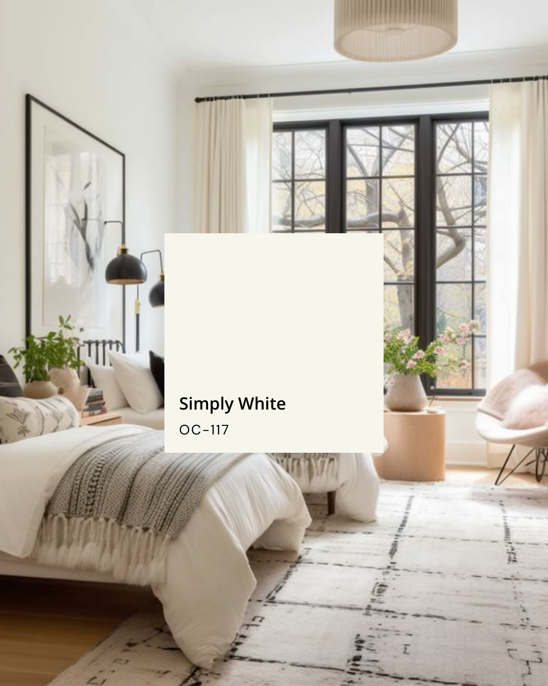
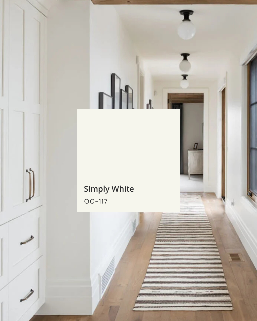
Simply White (Benjamin Moore) – A soft, warm white that still feels fresh. It’s beautiful on walls in spaces that get good natural light and looks clean without going cold.
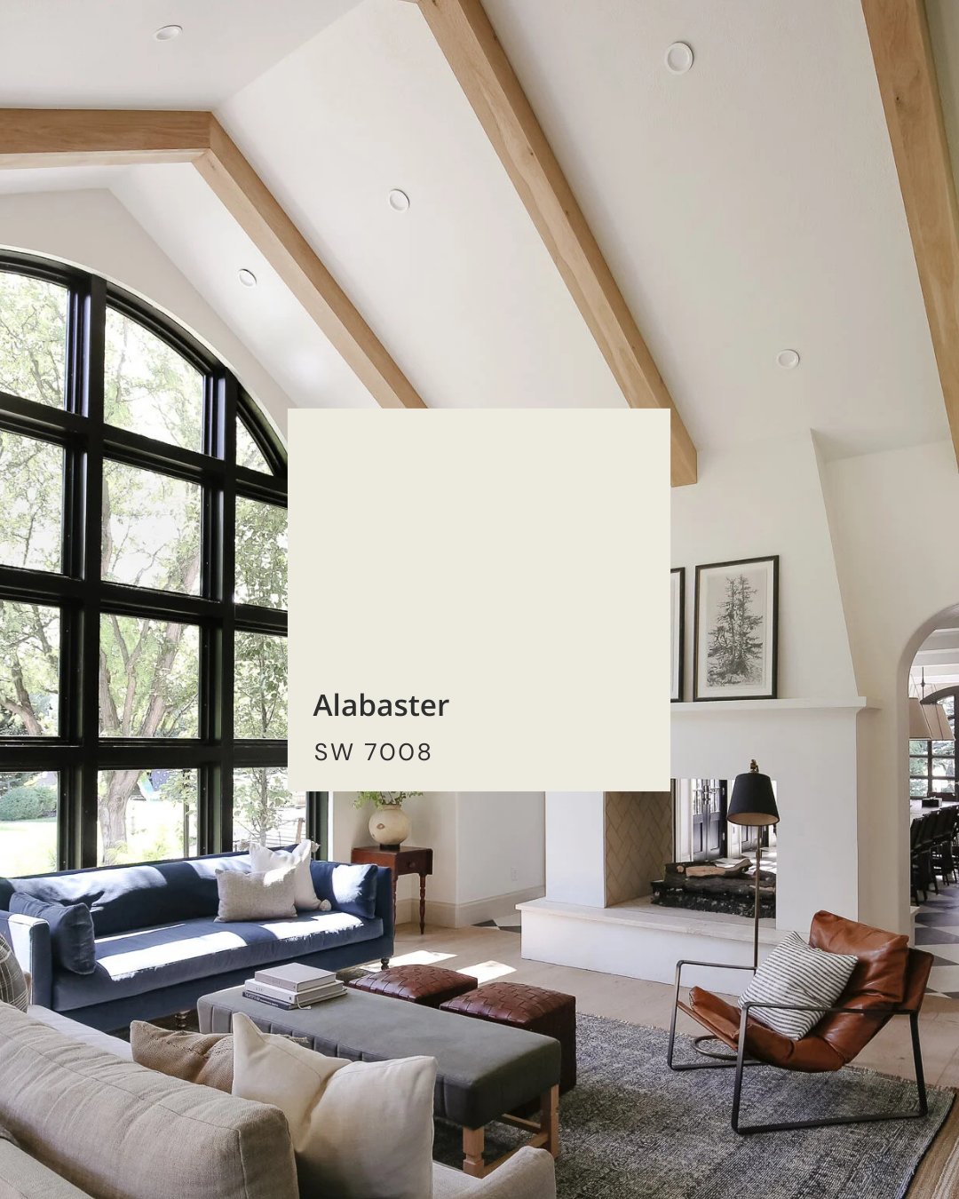
Alabaster (Sherwin-Williams) – A creamy, calming white that’s perfect for bedrooms and main living spaces when you want a gentle, inviting backdrop.
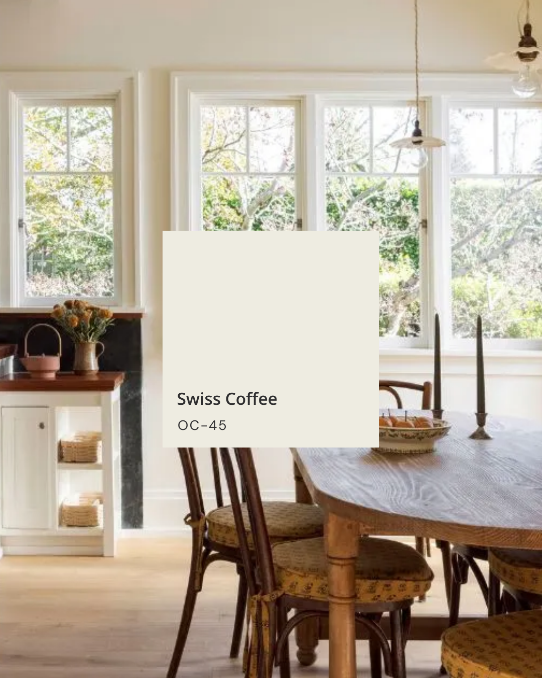
Swiss Coffee (Benjamin Moore) – A richer, slightly more “old-world” warm white that plays nicely with wood tones and earthy palettes, and is gorgeous in both interiors and exteriors.

These are the colors I reach for when a client says they want “white,” but really means soft, cozy, and timeless.
Softer, Neutral Whites: Versatile and Easy to Live With
Neutral whites sit in a sweet spot between warm and cool. They might lean a touch one way or the other, but they’re versatile and easy to pair with lots of different finishes.
They’re great when:
You have a mix of warm and cool elements in your home.
You want a white that feels tailored and clean, but not icy.
You’d like one color that can work in multiple rooms.
My go-tos here:
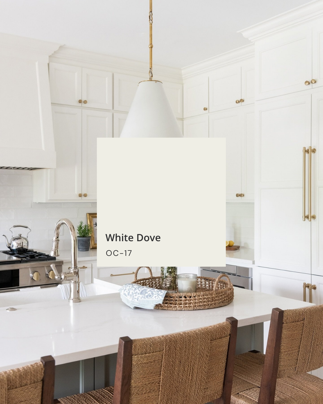
White Dove (Benjamin Moore) – A soft, milky off-white with just enough warmth. It’s beautiful on walls, trim, and cabinetry, especially in homes with natural wood and softer neutrals.
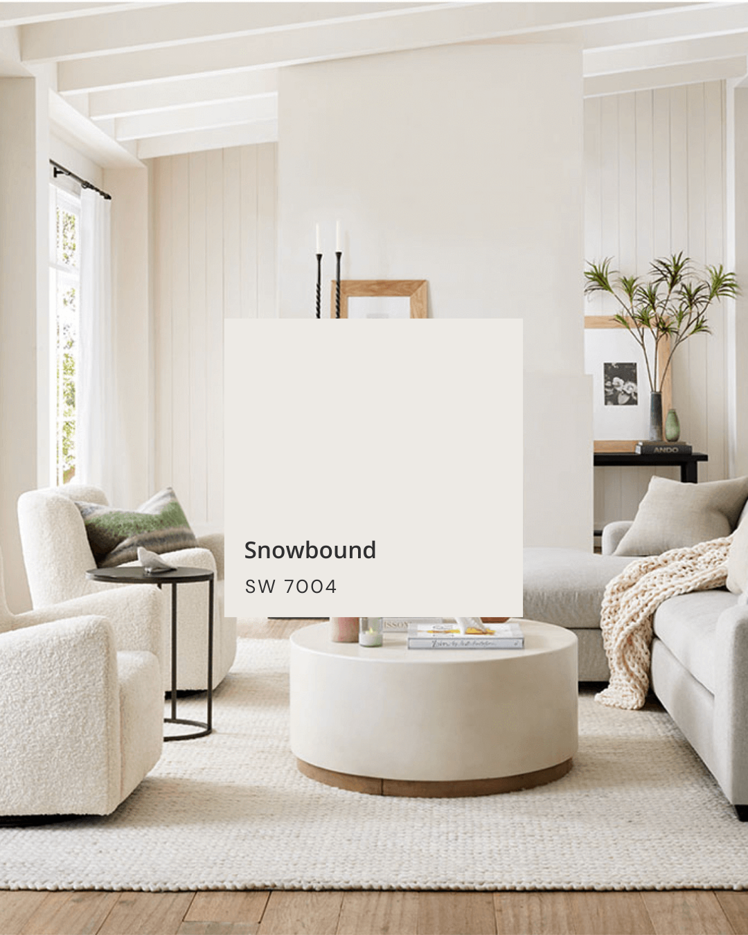
Snowbound (Sherwin-Williams) – A flexible, soft white that can read slightly cooler or warmer depending on the light. It’s a great “bridge” white when your home has both gray and warmer tones.

These are the colors I love when a space needs a calm, clean backdrop that still feels forgiving and livable.
Crisp, Clean Whites: Bright and Modern
Crisper whites feel lighter and brighter and can give a more modern, gallery-like look—without necessarily feeling sterile if you balance them well.
Use these when:
You love contrast with black, deep colors, or very modern finishes.
Your home gets lots of warm natural light and you want to keep things feeling fresh.
You’re looking for a clean trim or cabinetry color that still pairs well with other whites.
Favorites from my list:
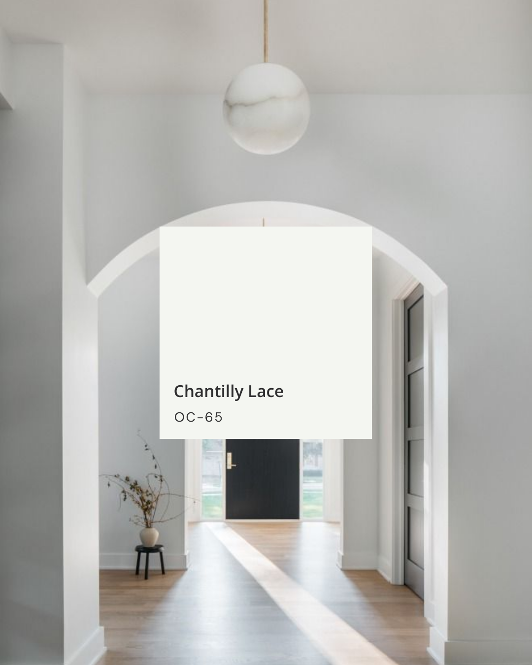
Chantilly Lace (Benjamin Moore) – A very bright, clean white that’s beautiful in spaces with lots of natural light, on trim, doors, and cabinetry when you want that crisp edge.
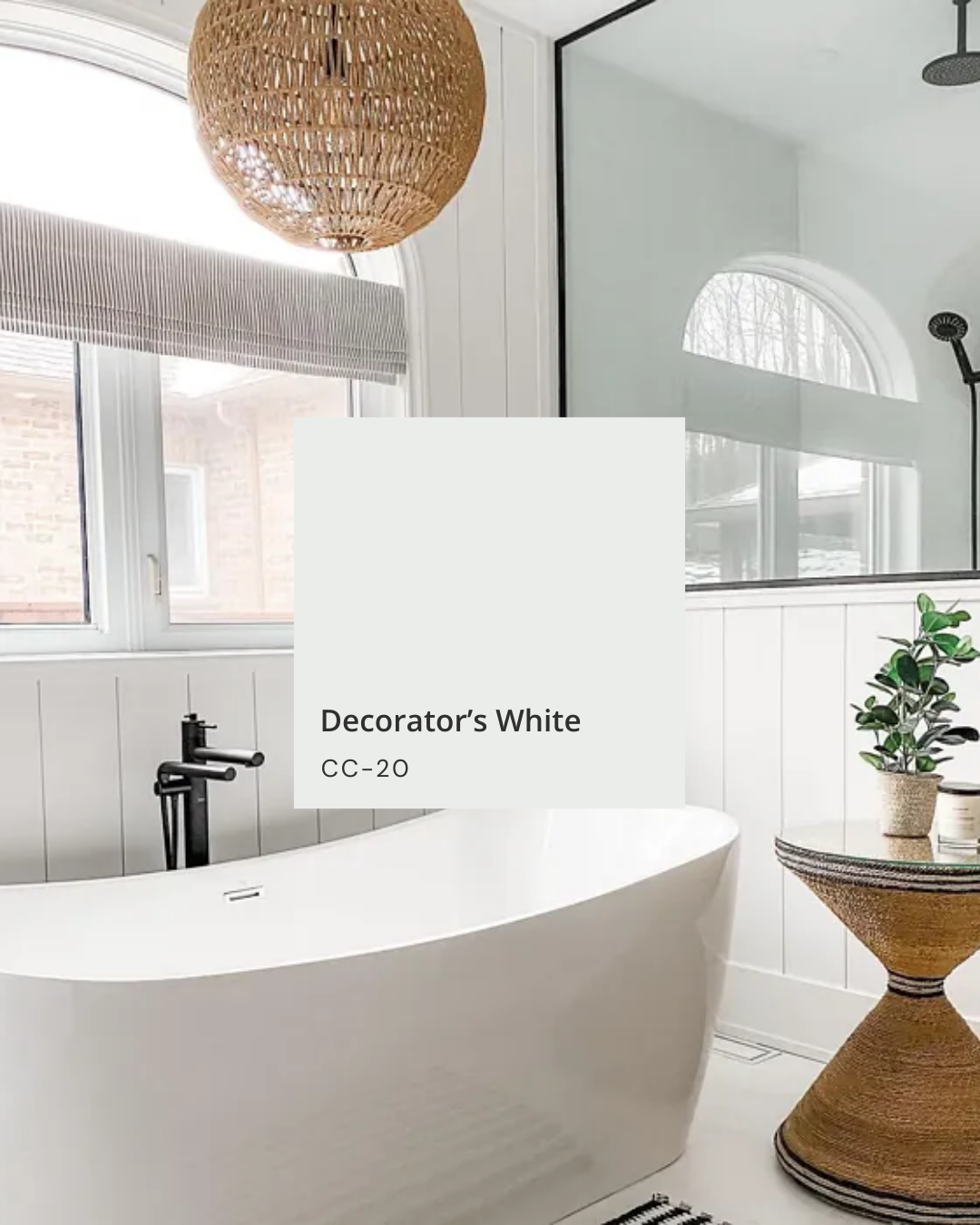
Decorator’s White (Benjamin Moore) – A tailored, slightly cool white that works wonderfully with gray stone, black hardware, and more modern palettes.
These are great options when you want your white to look intentional and sharp, especially paired with deeper wall colors or bold accents.


How to Test White Paint (So You Don’t Regret It)
No matter how many recommendations you save, the most important step is testing a few whites in your actual home. Here’s how I recommend doing it:
Choose 3–5 whites that fit the vibe you want (cozy, clean, bright, etc.).
Paint large swatches on more than one wall in the room (at least 12" x 12").
Look at them at different times of day: morning, mid-day, evening, and with lights on at night.
Hold your flooring, countertop, tile, or fabric samples next to each swatch.
You’ll quickly see which colors turn too yellow, too gray, or too cold—and which one stays soft and pretty all day.
You Really Can’t Go Wrong with These
Simply White, Dove White, Chantilly Lace, Decorator’s White, Alabaster, Swiss Coffee, and Snowbound are the whites I come back to again and again. They’re beautiful, reliable, and have all earned their place on my “favorites” list.
The key is matching the undertone to your home:
Choose warmer whites if you want cozy and soft.
Choose neutral whites if your home mixes warm and cool finishes.
Choose crisper whites if you love bright, clean, and modern.
If you’re staring at 20 white paint chips and feeling overwhelmed, you’re not alone—and this is exactly the kind of decision I help clients with all the time.


A Note on Inspiration Photos
The images in my original Instagram post — and likely the photos you’ve saved on Pinterest — are a great starting point, but remember: every room has different light, finishes, and exposures. Use them as inspiration, not a guarantee that the exact same color will look identical in your home.
Disclaimer: The photos that inspired this post are sourced from Pinterest and various blogs. They are not my work. If you see your work featured and I’ve missed tagging you, please reach out so I can credit you properly.
For more paint tips, home styling ideas, and real-life design inspiration, don’t forget to like, save, and follow @taranelsondesigns for more home and lifestyle content.